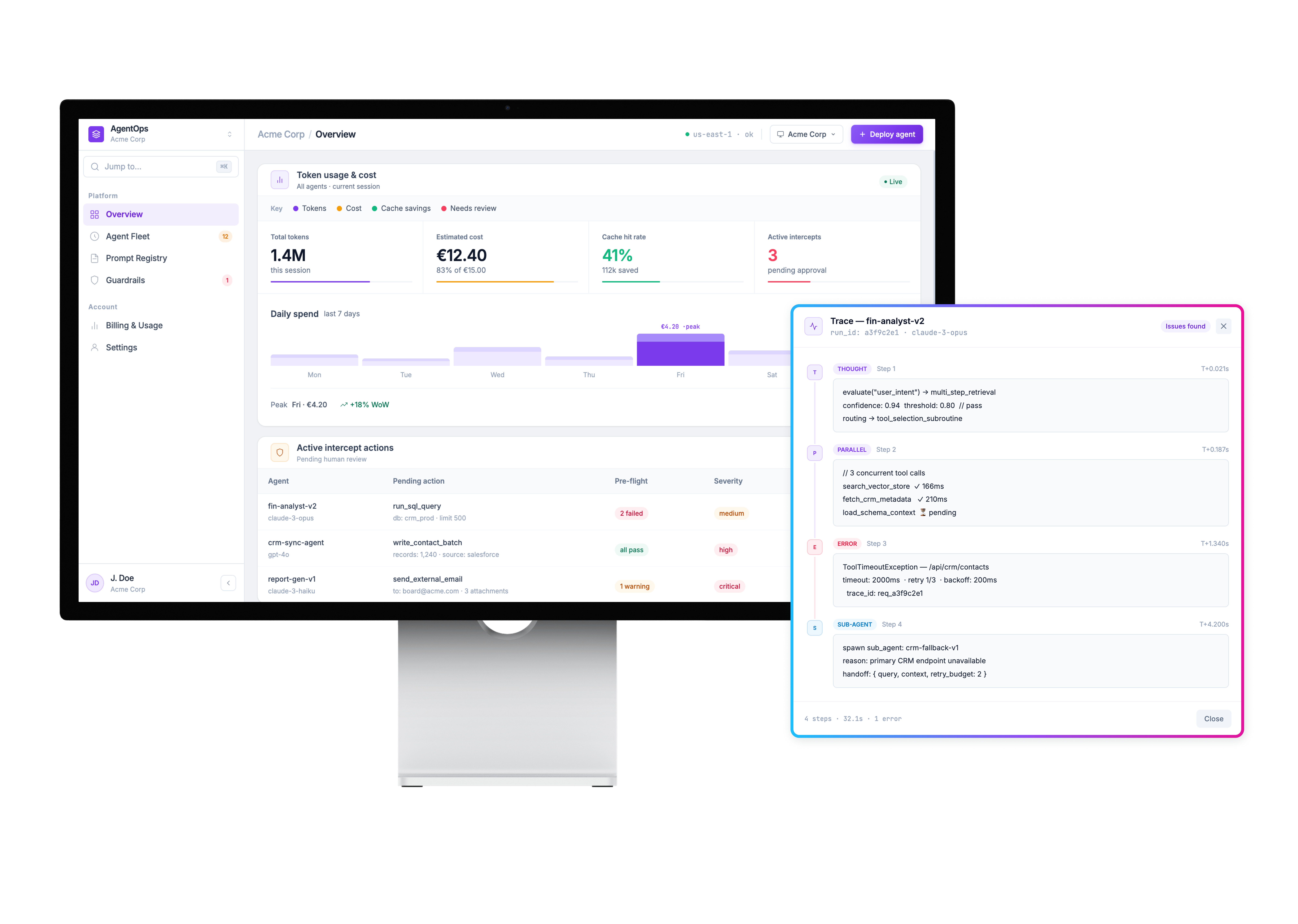
AgentOps is a monitoring and auditing workspace for autonomous AI agents. It tracks what agents are doing, how much it costs, what they're proposing to change, and where human review is required before anything executes.
I built this entirely with Claude and Cursor, including the full frontend implementation. Every view is clickable, every tab responds, every modal and diff viewer works end to end.
The project started as a personal question: as agentic workflows spread, how do you design for systems you can't fully trust? That question turned into a real product.
I started the way most people would: standard dashboard widgets, cards, status badges, the usual enterprise UI toolkit. Within a couple of weeks it was clearly the wrong approach.
This isn't a CRM or an analytics tool. The screens need to hold reasoning traces, multi step audit trails, and diffs between what an agent proposed and what a human approved. Generic components couldn't carry that density.
That became the real brief. Not "build a monitoring tool". The real question became: what does a UI look like when its only job is showing you exactly how much to trust a decision you didn't make yourself.
The workspace is structured around four distinct views, each scoped to a specific oversight concern. The goal was to make the information hierarchy feel obvious — you should always know where you are and what level of risk you're looking at.
Live token spend, cache hit rate, cost projection, and a real-time intercept queue. Everything that needs awareness before action lands here first.
The spend chart and active agent count update continuously. Intercept alerts surface at the top so nothing critical gets buried beneath routine telemetry. It's the first screen to check when something feels off.
Each agent in the fleet has a row showing its current status, which model it's on, what task it's running, and the last action it took. Status badges make triage instant.
Click any row to open the full reasoning trace: a step by step timeline of how that agent moved from input to output, including every tool call, retry, and parallel branch along the way.
Every system prompt running in production is tracked with a full version history. Diff any two versions to see exactly what changed, who changed it, and when it was deployed.
Prompt changes are behavioural changes. They affect agent output in ways that are invisible unless you have a record. The registry makes prompt management a first-class engineering concern, not an afterthought.
Guardrails define the thresholds that trigger a mandatory human review before an action executes. Cost limits, action type restrictions, output confidence bounds — all editable and auditable from here.
Each rule has a live test runner so you can verify it fires correctly against a real agent output before deploying. Guardrails are not an add-on. They are the mechanism that makes autonomous execution safe enough to run at all.
Most of the design time went into two features that don't exist in standard dashboards. They're not observability for its own sake. They're the mechanism for calibrated doubt. They give reviewers exactly enough information to make a good call, without drowning them in everything.
Both features came out of asking the same question from different angles: what does a human need to see to decide whether to trust this?
A sequential view of how an agent moved from input to output, including parallel tool calls, retries, and sub agent spawns. A reviewer isn't just looking at a final answer. They're looking at the path that produced it.
Before a high-stakes action executes, you see exactly what the agent is proposing to change, shown side by side with the current state. Same pattern as a code review. Approve, reject, or edit before anything ships.
The goal was a tight token set that lets the content do the work. Reasoning chains, diffs, guardrail rules. When the interface itself is interesting, something has gone wrong.
Color is reserved for semantics only. Every tint means something specific. Nothing is decorative. If you see green, something is running. If you see amber, something needs attention. If you see red, something is halted.
Typography splits across three typefaces with clear jobs: display weight for structure, Inter for prose, JetBrains Mono for everything that is data.
The hardest problem wasn't any single screen. It was figuring out what to show at all.
Agents don't fail the way normal software fails. There's no crash, no error state. They produce a confident, plausible, sometimes wrong answer. So the design question was never "how do I visualise what the agent did."
It was: how do I give someone enough information to know when they should not trust this?
That's a different brief than most dashboard work. It's not observability for its own sake. It's designing calibrated doubt on purpose. The current version leans on exposing the reasoning trace and forcing a review step before high stakes actions via the diff viewer, but I'm still not convinced that's sufficient for genuinely ambiguous cases. That's the open problem.
I used Claude and Cursor throughout, not just for the design but for the full implementation. Every interaction state, every diff viewer, every reasoning trace timeline is working frontend code, not a mockup.
That collapsed the gap between design decision and technical reality in a way that changed how I think. Some ideas that looked fine in a component sketch fell apart the moment they had to hold real interaction state. Others turned out to be simpler to build than they looked in Figma.
Building the product rather than handing it off made the tradeoffs concrete in a way they rarely are when design and engineering are separate roles.
Frontend only. Trace and telemetry data is hardcoded. Every tab, modal, diff viewer, and reasoning trace responds. The interaction model is complete end to end. No backend, no real agent behind it yet.
Building this changed how I think about AI interfaces generally, including in my day job. Confidence and uncertainty need to be first-class UI states, not an afterthought bolted onto a normal dashboard. Most AI product interfaces treat uncertainty as an error to suppress. This project made me convinced that's the wrong instinct.
When the system is taking actions on your behalf, the most important thing it can communicate is not what it's doing. It's how sure it is, and what you should check before you trust it. That's a design problem most teams haven't started solving yet.