As the captain of a cross-functional team during a one-week company-wide hackathon at BuildingMinds, I drove the concept, design, and initial implementation of a critical platform redesign.
My team consisted of two Frontend Developers, one Backend Developer, and one additional Designer, whom I successfully guided to deliver a high-impact solution under intense time constraints. Our project centered on fundamentally changing how users interact with core business data by introducing a dynamic, user-centric widgeting system.
The success of this hackathon led to a pivotal moment for BuildingMinds. The company recognized the strategic value of the widget system and made the unprecedented decision to redesign the entire core platform based on our foundational work.
The goal of the Proxima Redesign was platform transformation through user empowerment. We engineered a modular widget ecosystem and a new navigation architecture that fundamentally reorganized information delivery.
Users gained the power to define their own information hierarchy: selecting data, creating custom datasets, and personalizing their dashboard layouts based on their specific business context. This innovation successfully converted an overwhelming data landscape into a focused, actionable decision-making tool.
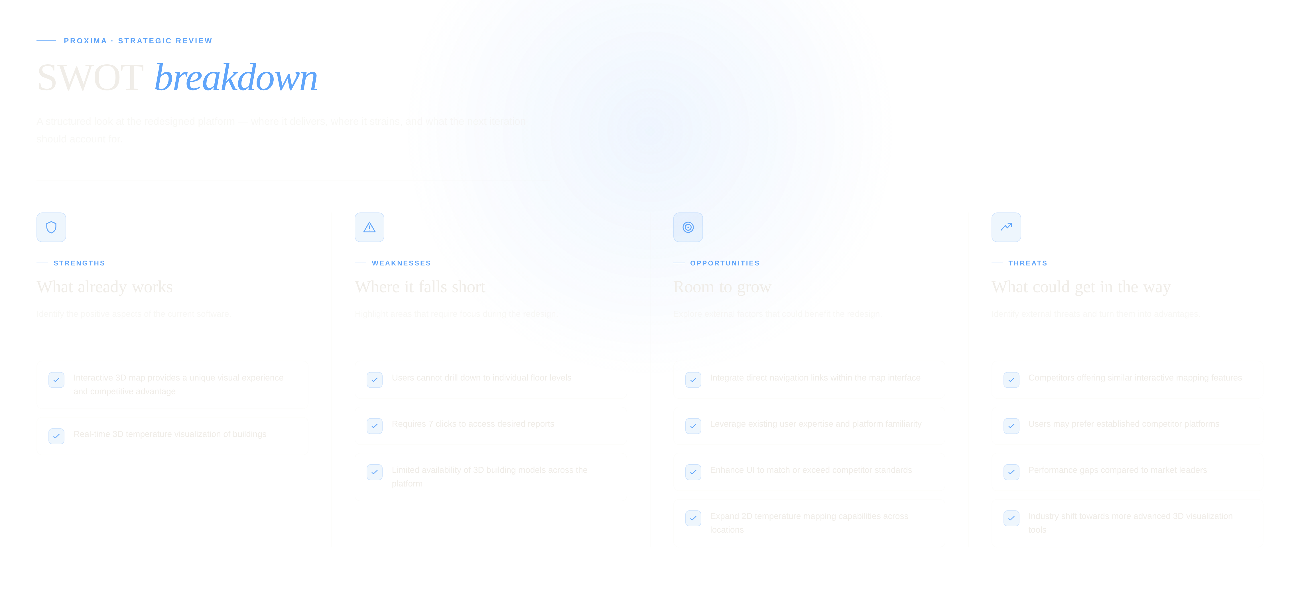
Before designing anything, we needed to understand everything — mapping competitive context, user behaviours, usage patterns, and the full extent of the product's UX debt.
We secured the platform by mitigating external Threats (such as new competitors) and prioritized feature development to capitalize on high-potential market Opportunities, guaranteeing the new platform delivers long-term value.
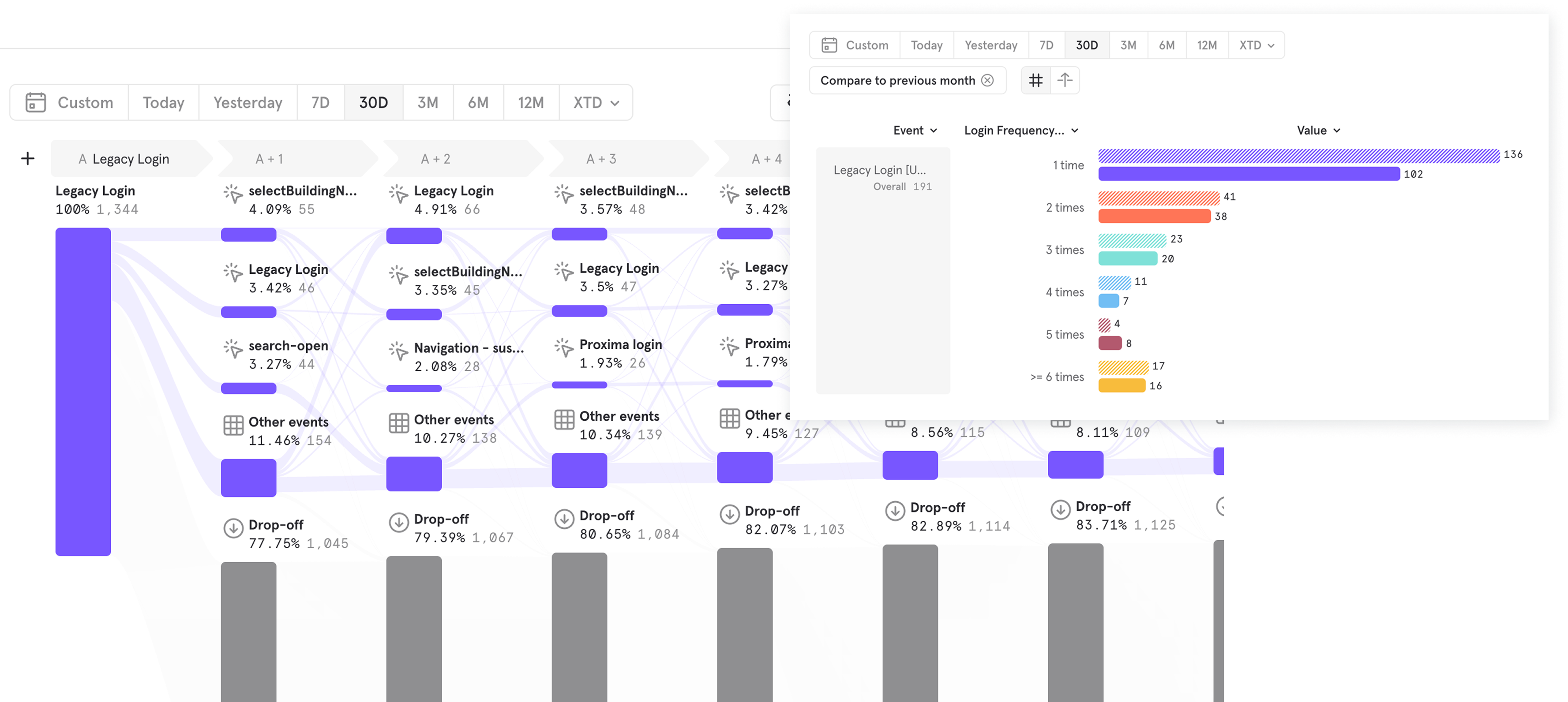
Session recordings, usage heatmaps, and behavioural analytics revealed patterns that contradicted the product team's assumptions at nearly every turn. 32 user interviews across 4 role types confirmed a consistent pattern: users were spending significant time fighting the interface rather than making decisions.
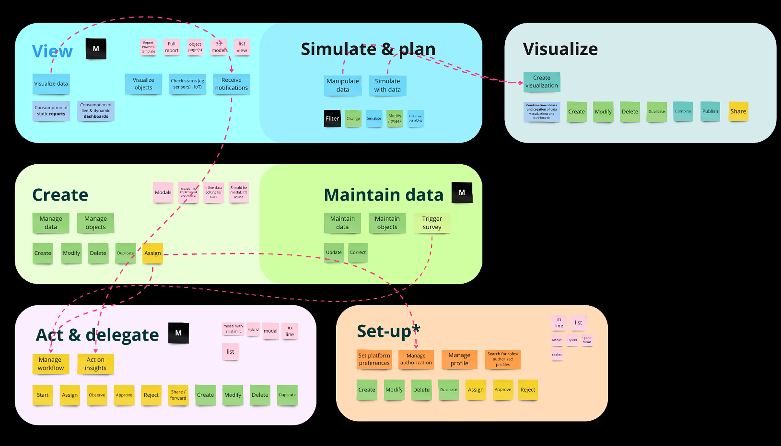
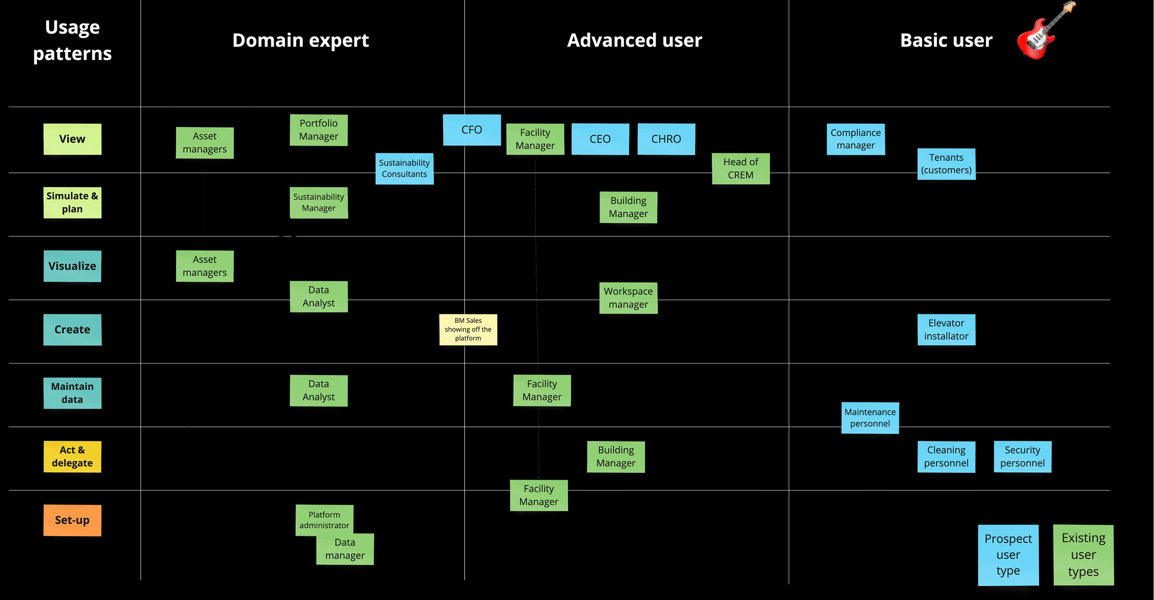
Usage patterns identify the basic interactions our users perform with the platform. Each usage pattern collects all the use cases that share a common pattern (for example, "Create" includes "Create a record in a table," "Create a building in the DB," and "Create a document," among others).
The aim of the usage patterns is to help designers identify the user journeys that apply to specific requirements while ensuring consistency across the platform.
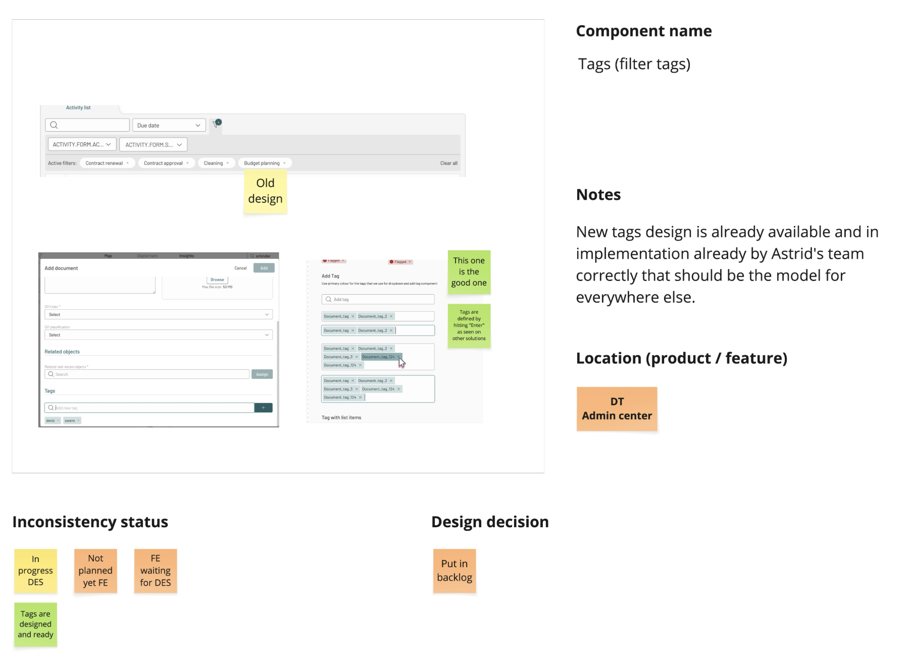
A full UI audit of the hackathon-era product catalogued over 200 inconsistencies across components, spacing, typography, and navigation patterns. The same action — filtering, for example — had different UI treatments across modules. Users had to relearn patterns they'd already learned, creating friction that compounded with every interaction.
Following the initial research phase, I translated the findings into a high-fidelity design and interactive prototype. This iteration specifically prioritized resolving navigation friction, a critical pain point. I then collaborated with two other UX designers to conduct usability testing, validating the solution and gathering further insights.
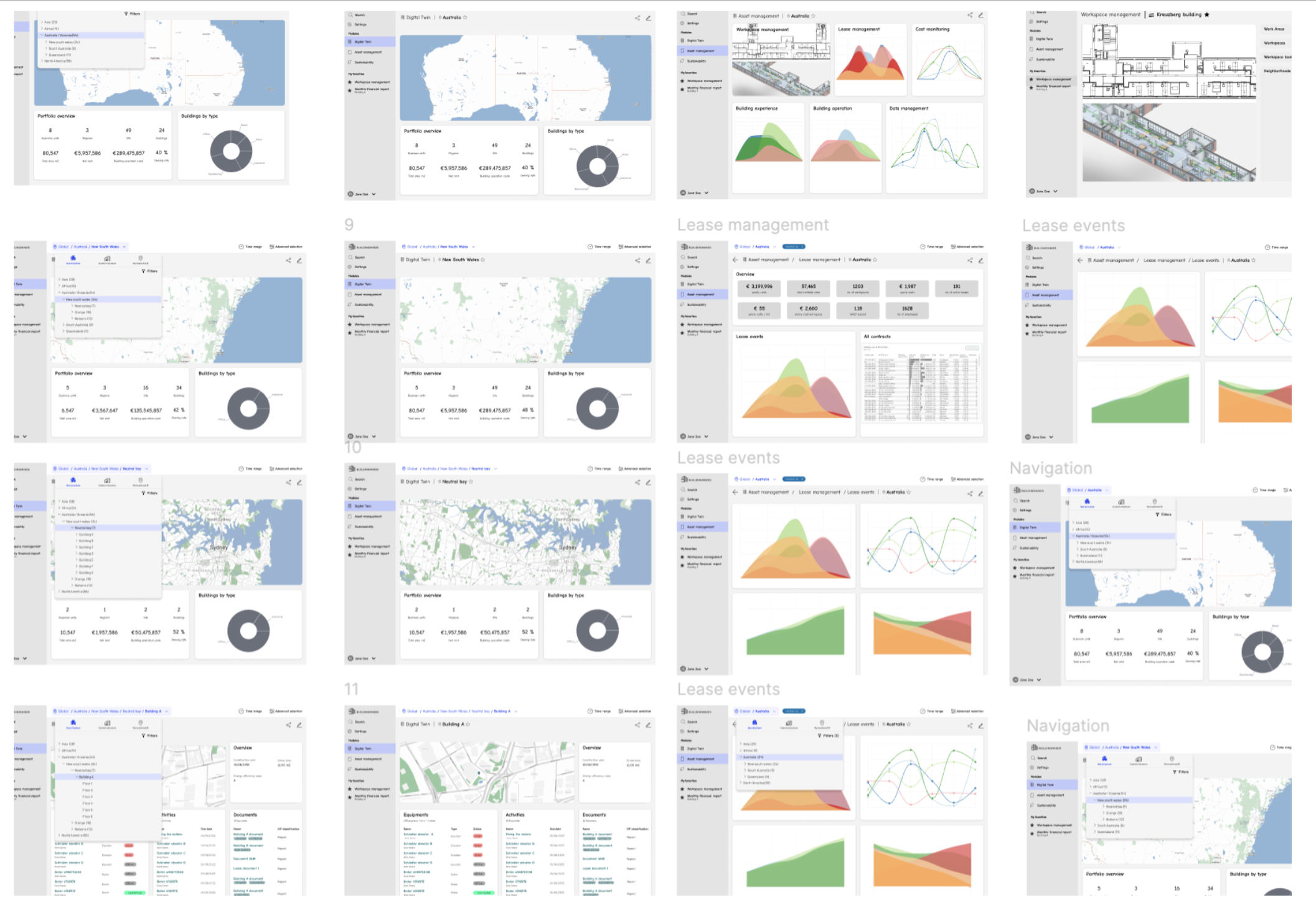
After an extensive research phase, we had a comprehensive picture of user pain points and structural problems. None of it would translate into product change without stakeholder alignment first.
We presented the research findings to cross-functional teams to align them on the upcoming redesign. Recognizing the importance of stakeholder feedback, we facilitated a two-day workshop focused on refining the navigation structure. The session prioritized information architecture, specifically aiming to optimize content grouping and identify areas of redundant content.
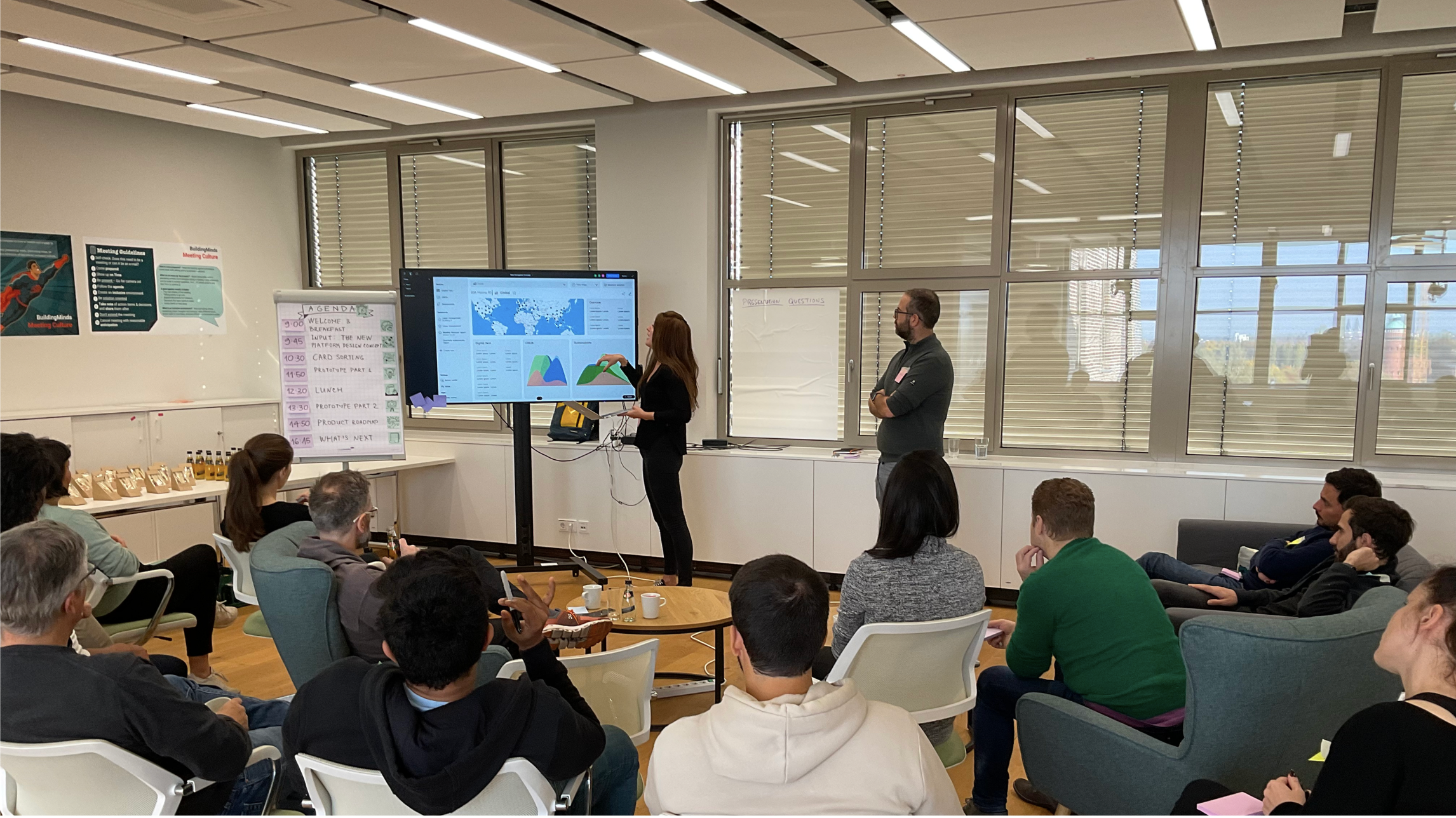
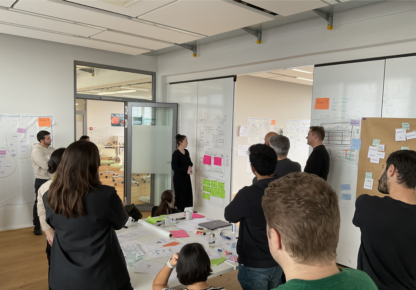
A three-part workshop with six cross-functional teams (Design, Product, Engineering):
With alignment secured, we moved from diagnosis to definition — mapping user types, journeys, information architecture, and the visual language that would carry it all.
Following our initial discovery workshops, we collaborated with Designers and Product Managers to bridge the gap between high-level ideas and detailed UX design. We developed a User Type Matrix to map various personas against their primary actions within the platform.
This visualization allowed the team to identify overlap (where different user types shared common goals), prioritize focus (voting on high-impact user types for the next phase), and inform architecture (acknowledging that because our personas have unique goals, their journeys must be designed as distinct, tailored experiences).
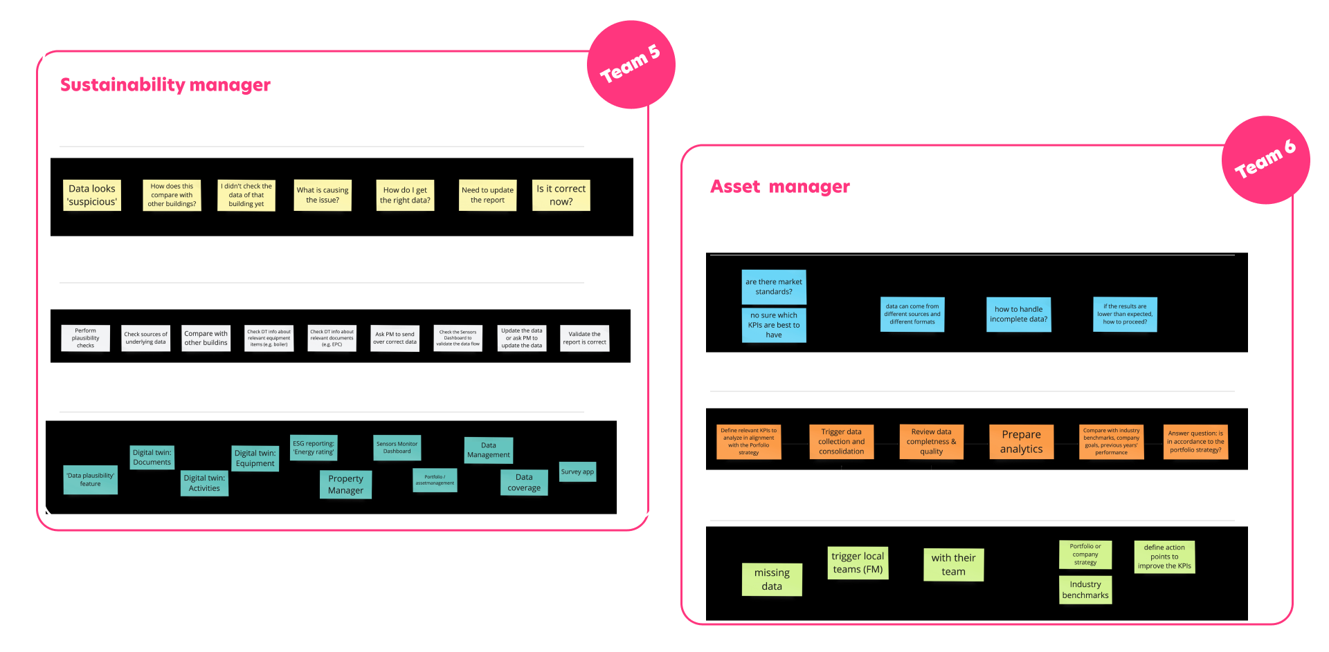
Once we reached a consensus on our priority personas, we transitioned into an intensive journey mapping exercise. To ensure deep focus and efficiency, we broke the workshop into smaller squads: each group took ownership of one specific persona, working in parallel to map out distinct user journeys simultaneously.
Each squad included both designers and product managers to ensure the journeys were both user-centric and technically feasible.
With the user journeys clearly mapped, the final step was to define the platform's structure. We tasked each group with translating their persona's journey into a functional sitemap.
By building sitemaps based on specific journeys, we ensured that the navigation and page hierarchy were rooted in actual user behavior. This allowed us to see where different personas required shared pages and where unique, dedicated views were necessary for the redesign.
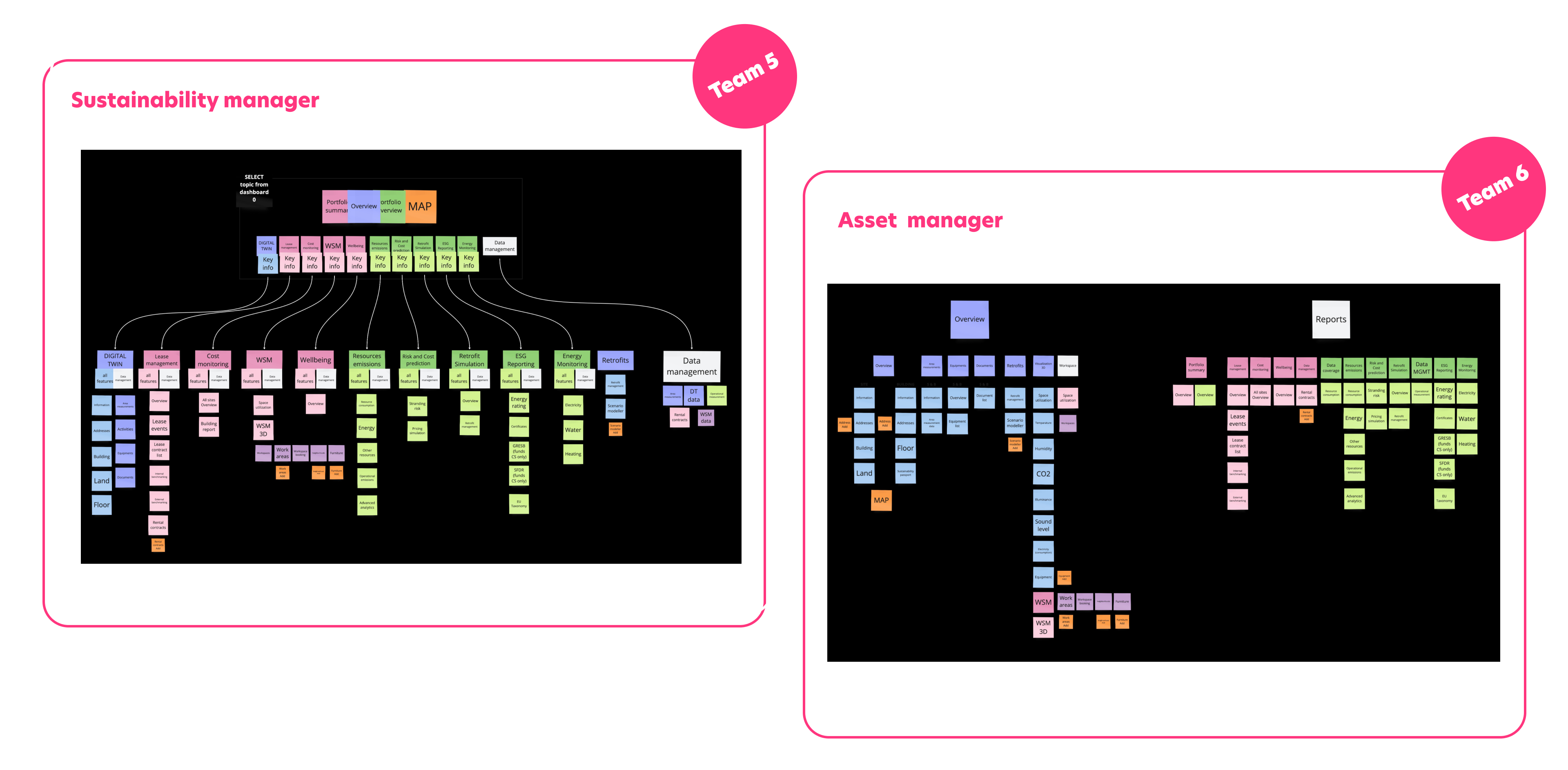
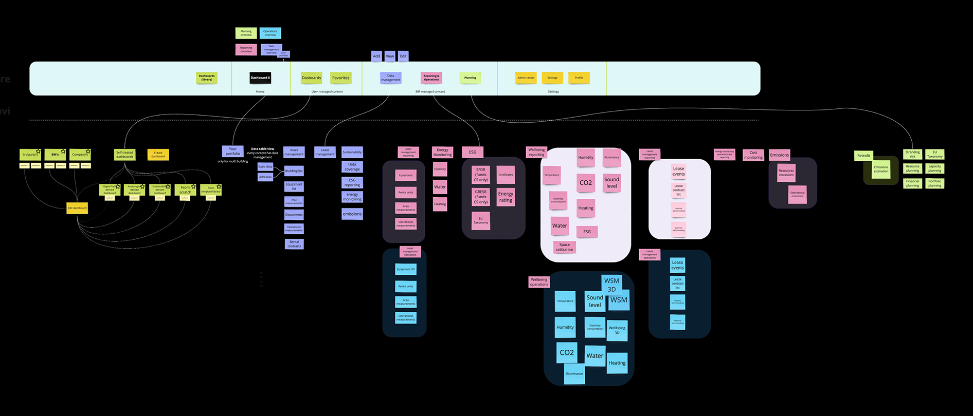
The design team merged the PM-led group sitemaps into a single unified system:
With the merged sitemap as our guide, we moved into the core IA phase. We transformed the static page lists into a dynamic map that defined how data and users move through the platform.
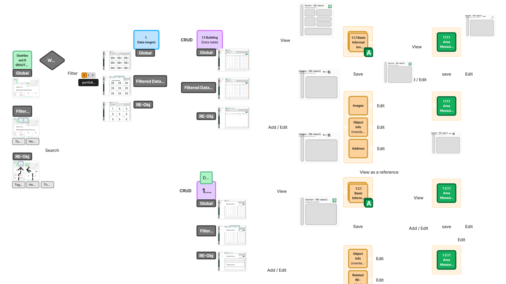
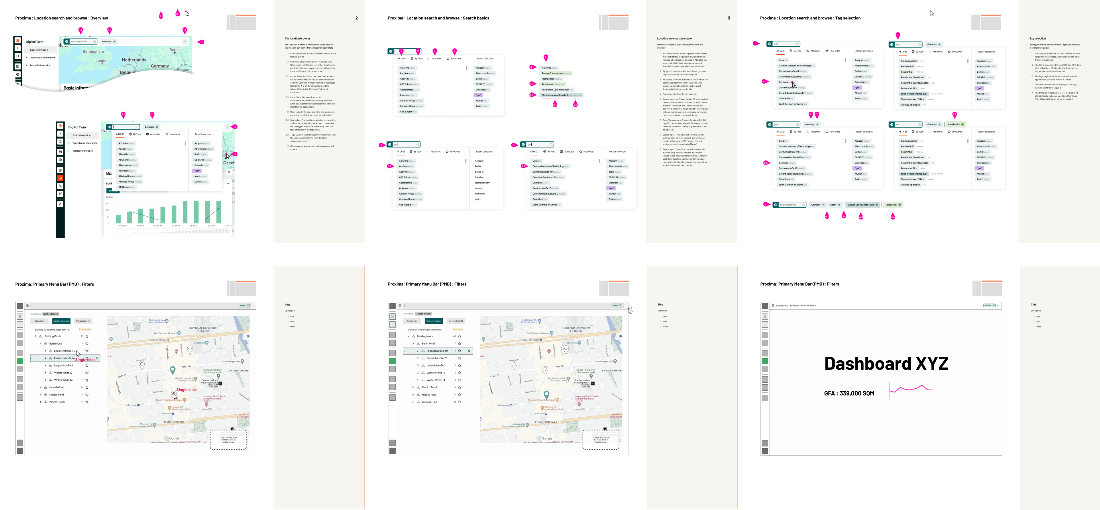
With a solid Information Architecture in place, we transitioned into Detailed UX Design. This phase was about translating our structural blueprint into a tangible interface, focusing on how users would actually move through the system.
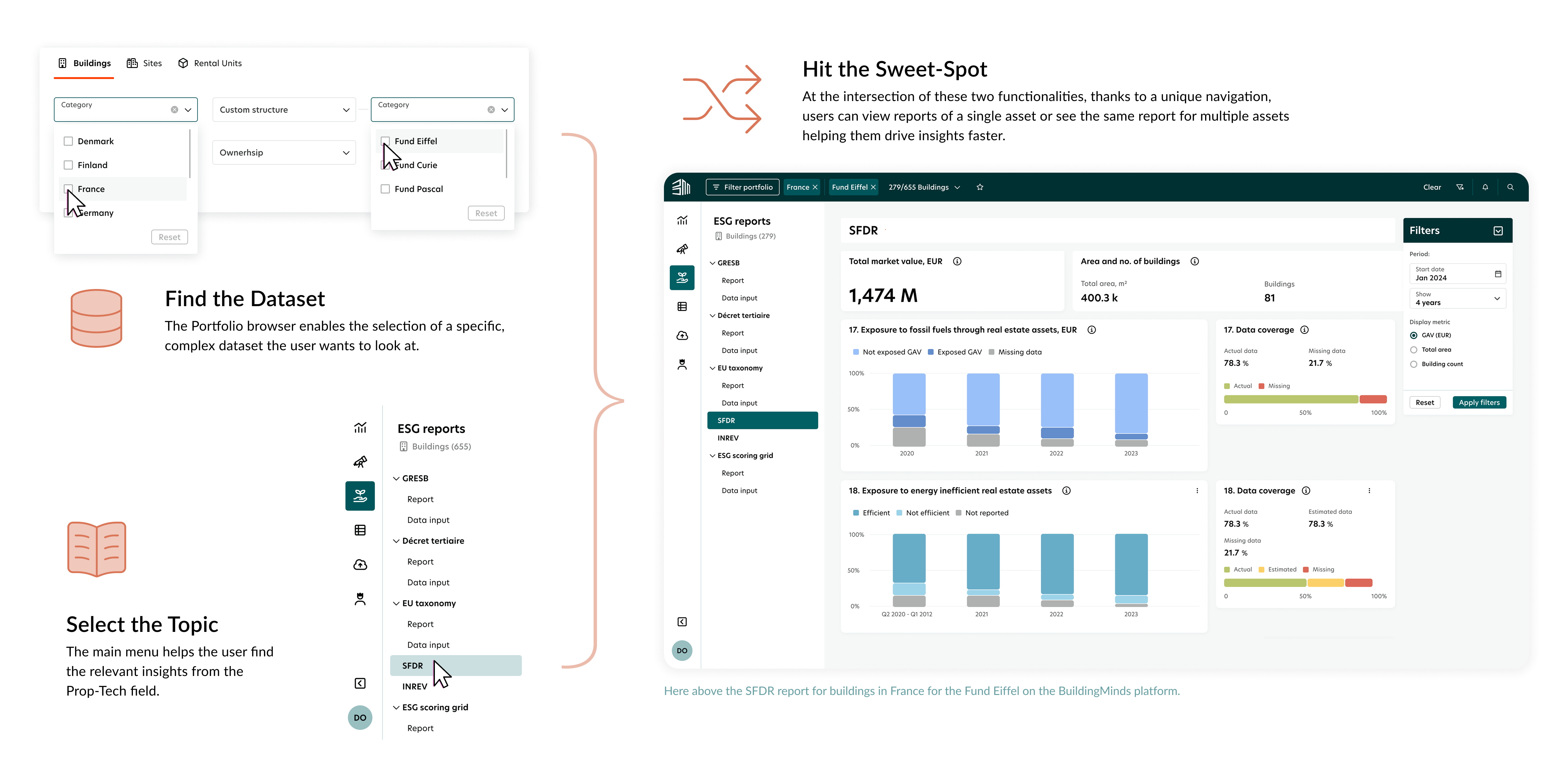
Primary focus: the Navigation System as the platform backbone:
While the UX work was in progress, a parallel workstream explored the visual language. Three directions were developed, presented, and stress-tested against the product's functional requirements and the expectations of enterprise real estate users.
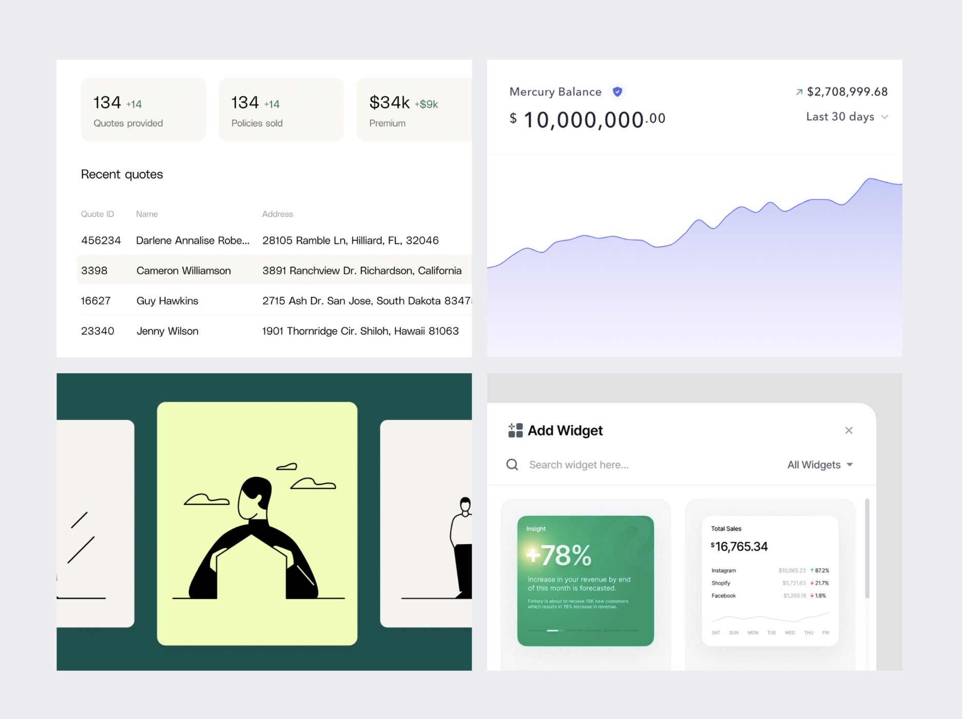
A stripped-back, data-first approach that removed all visual ornamentation. Maximum information density, minimum interface noise. Strong for power users; risked feeling cold for occasional users.
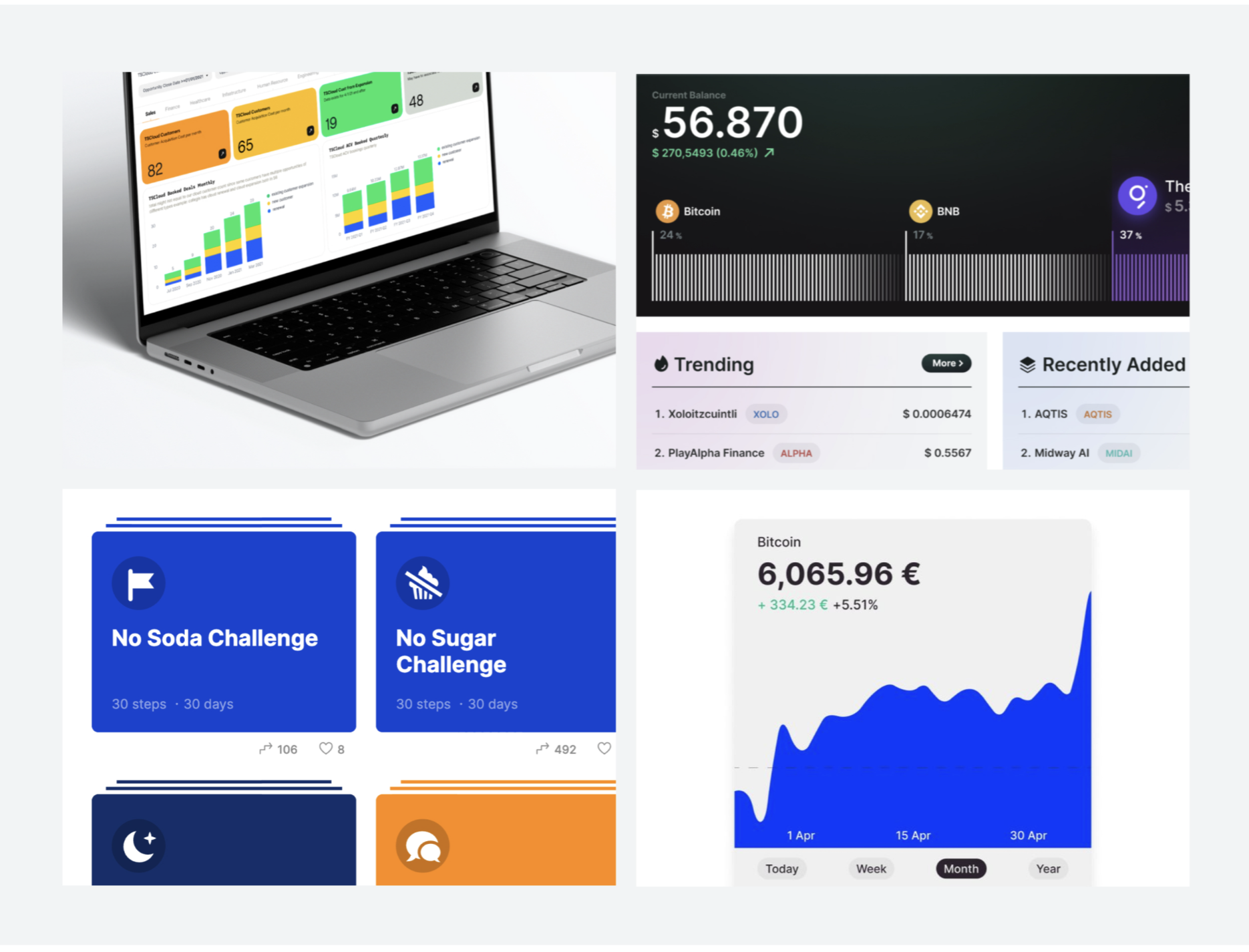
A high-contrast, brand-forward direction using strong typographic hierarchy and saturated accent colours. Expressive and confident — but too heavy for a data-dense enterprise environment.
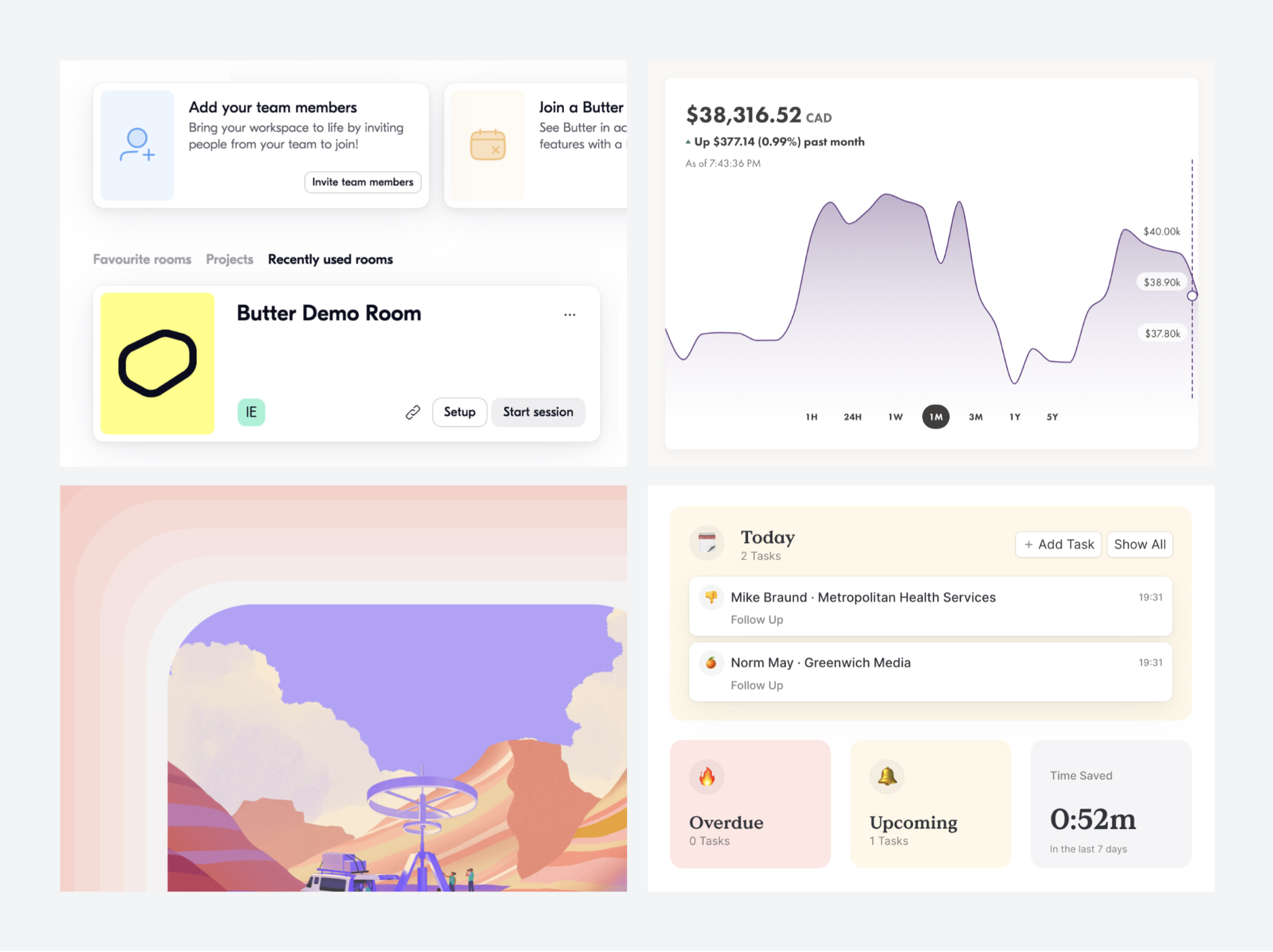
A premium enterprise aesthetic balancing density with breathing room. Restrained colour, considered typography, precise grid alignment. It felt trustworthy and capable — the right register for fund managers making multi-million-euro decisions.
A comprehensive redesign can be approached in fundamentally different ways. Each carries different risk, speed, and impact on existing users. We evaluated four implementation strategies before committing to one.
Improve the product feature by feature without disrupting the existing system. Low risk but slow cumulative impact. Inconsistencies between old and new components compound before they resolve.
Redesign component by component. Allows continuous delivery of improvements, but creates a transitional period where some modules look new and others old. Users experience the change as fragmented.
Design everything, then launch everything simultaneously. Maximum coherence on launch day, but maximum risk — a large simultaneous change is disorienting for users and has nowhere to retreat.
Run strategic design and implementation in parallel, migrating users and modules gradually while keeping the existing product fully functional. High-level design decisions made early provide a north star for each sprint — while implementation is sequenced by value and feasibility, not by completeness.
Over 12 months, every design decision made in the previous four steps was translated into working product. Five significant before/after transformations — each solving a specific, documented user problem.
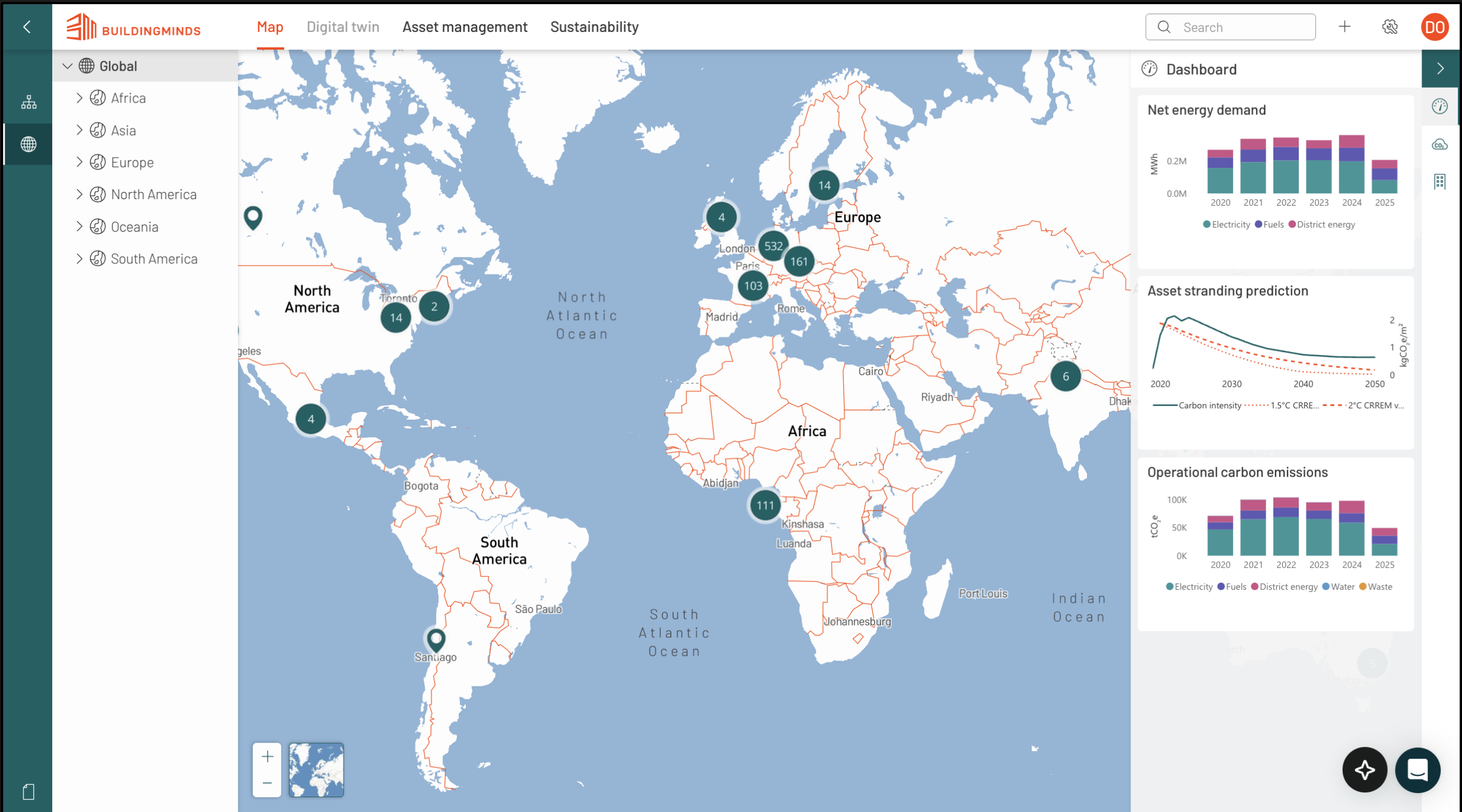
The map-centric interface forced users to hunt through geographic pins to find critical data, prioritising spatial layout over task management. This passive design created significant friction, hiding urgent information and leading to 'click fatigue' and delayed responses.
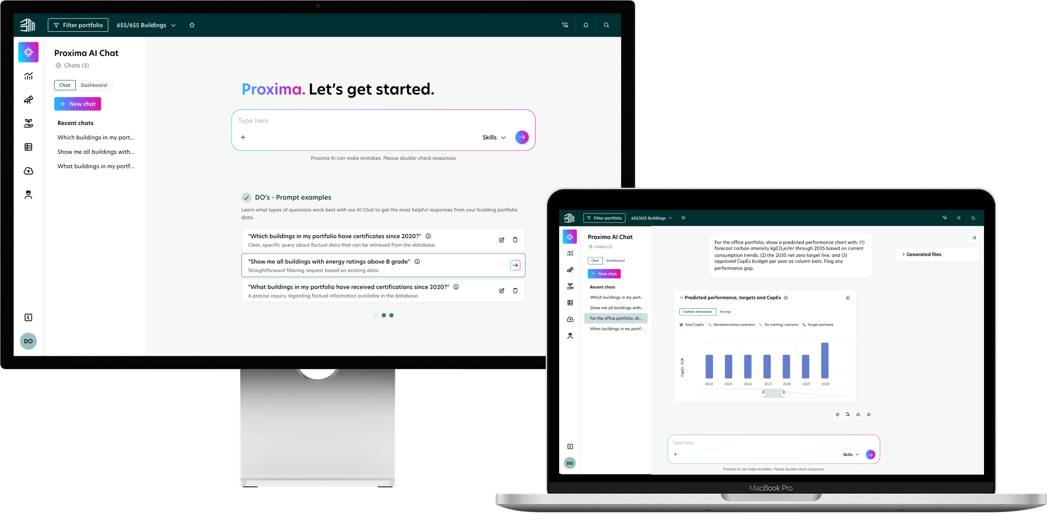
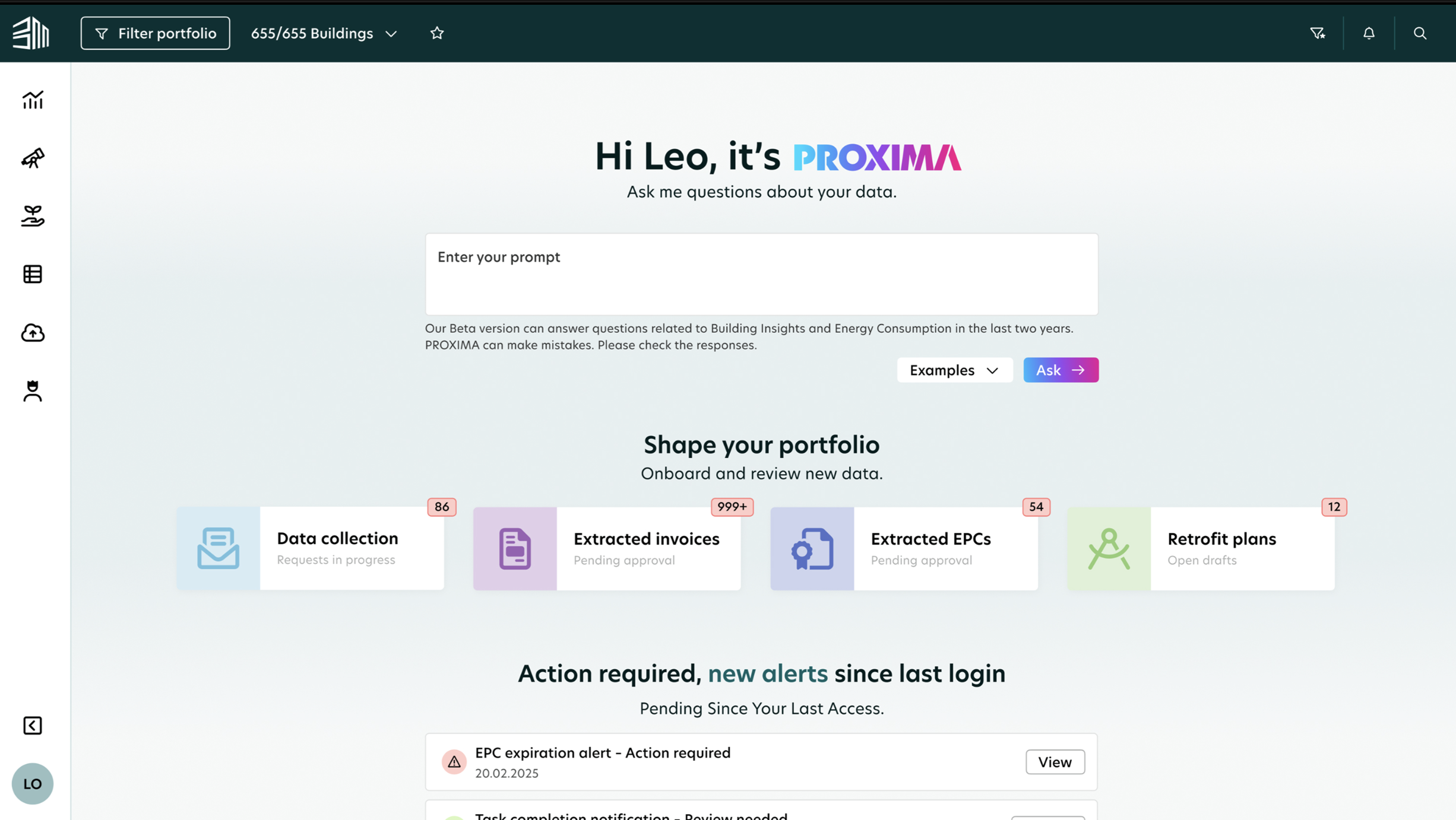
The redesigned dashboard replaces complex navigation with a customisable, action-oriented feed. By surfacing real-time notifications and integrating an AI chatbot for instant queries, the interface shifts the user from searching for problems to executing immediate solutions.
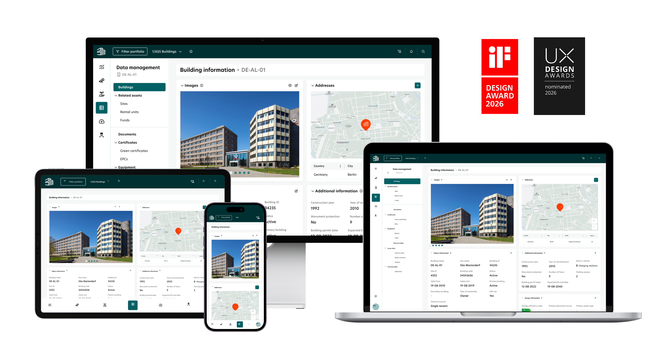
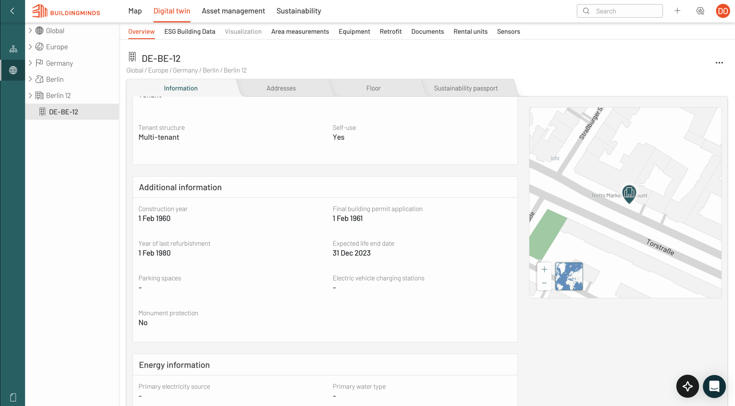
The legacy interface utilised a restrictive three-level navigation system that forced users to scan through dense text and tabs to find specific data. This deep nesting created significant friction, as critical building details were trapped in a spreadsheet-like format that lacked visual hierarchy and slowed down the decision-making process.
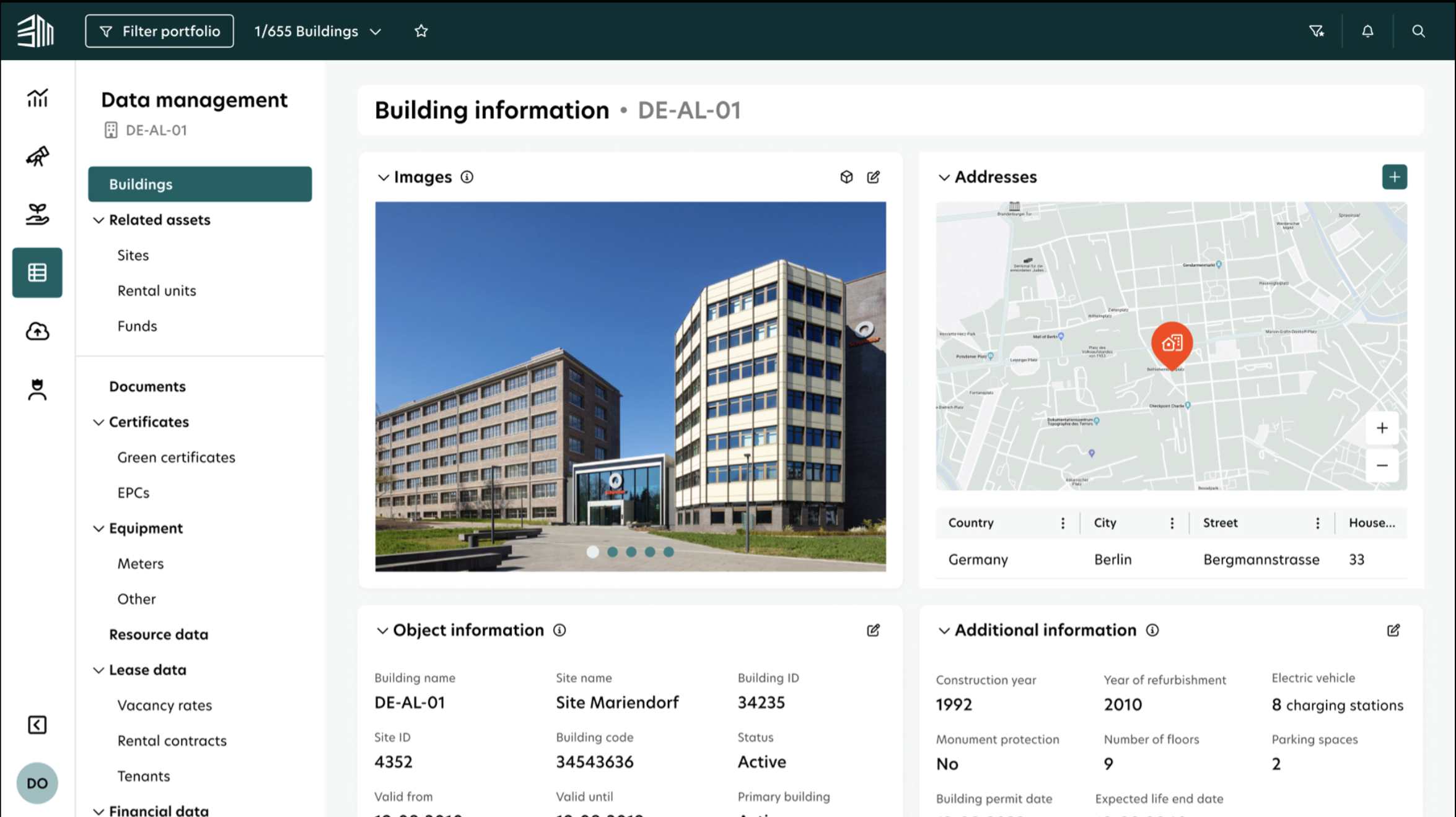
The redesign introduces a modular widgeting system that drastically improves screen utilisation and scannability. By prioritising visual assets and grouping related data into digestible cards, the new layout allows for a 1:1 ratio of information to action, enabling users to extract key building insights at a glance without navigating multiple menus.
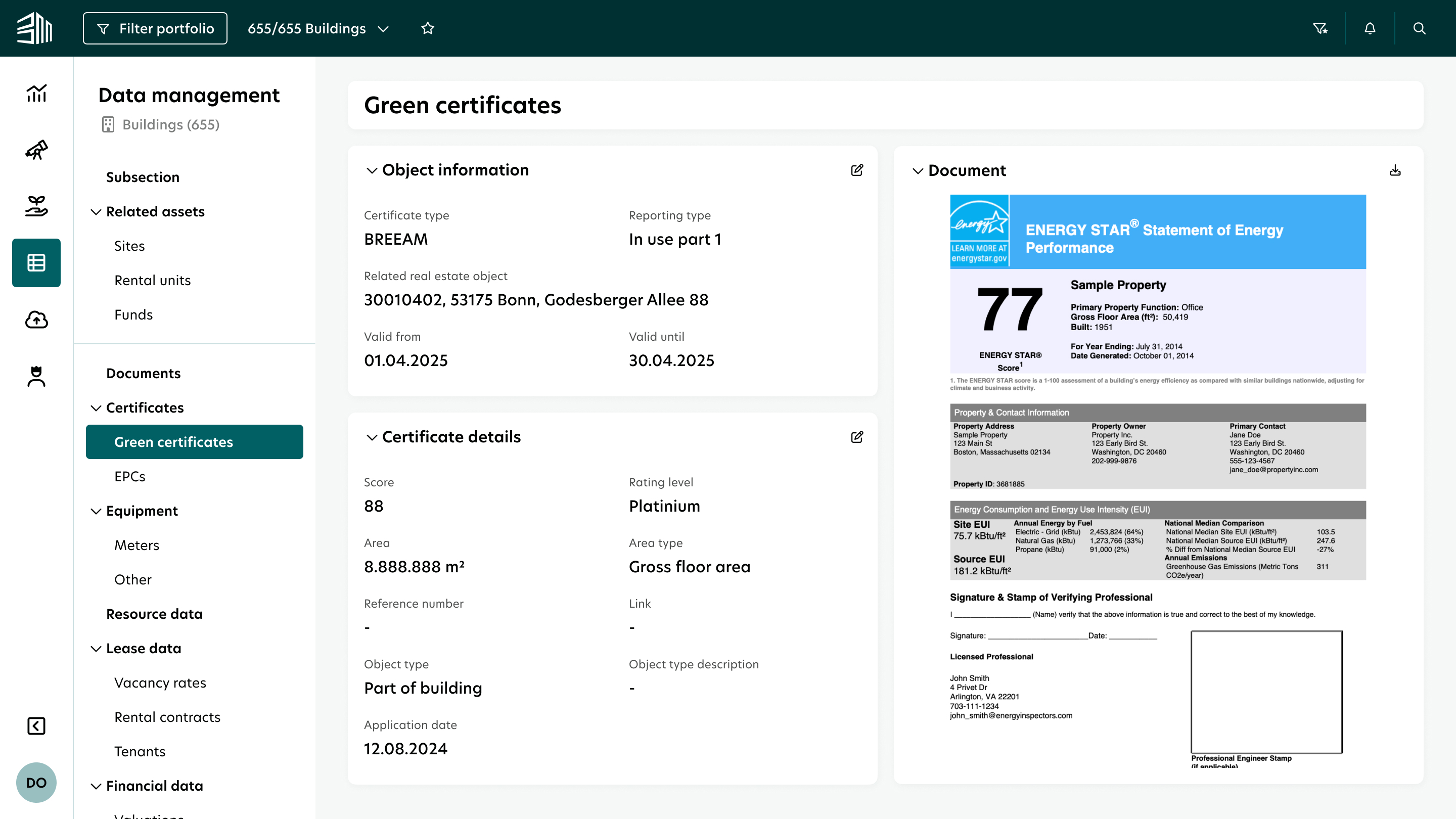
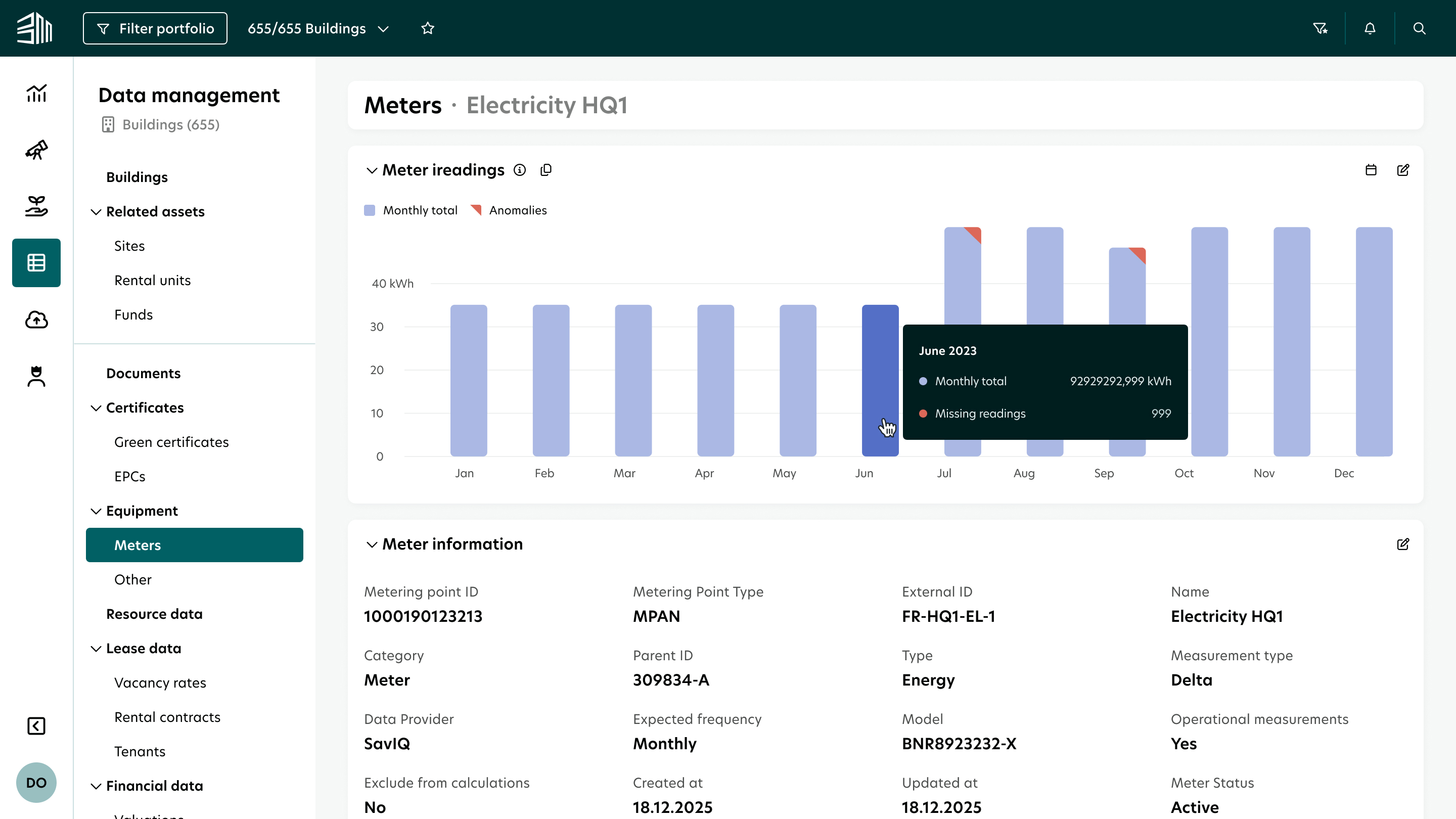
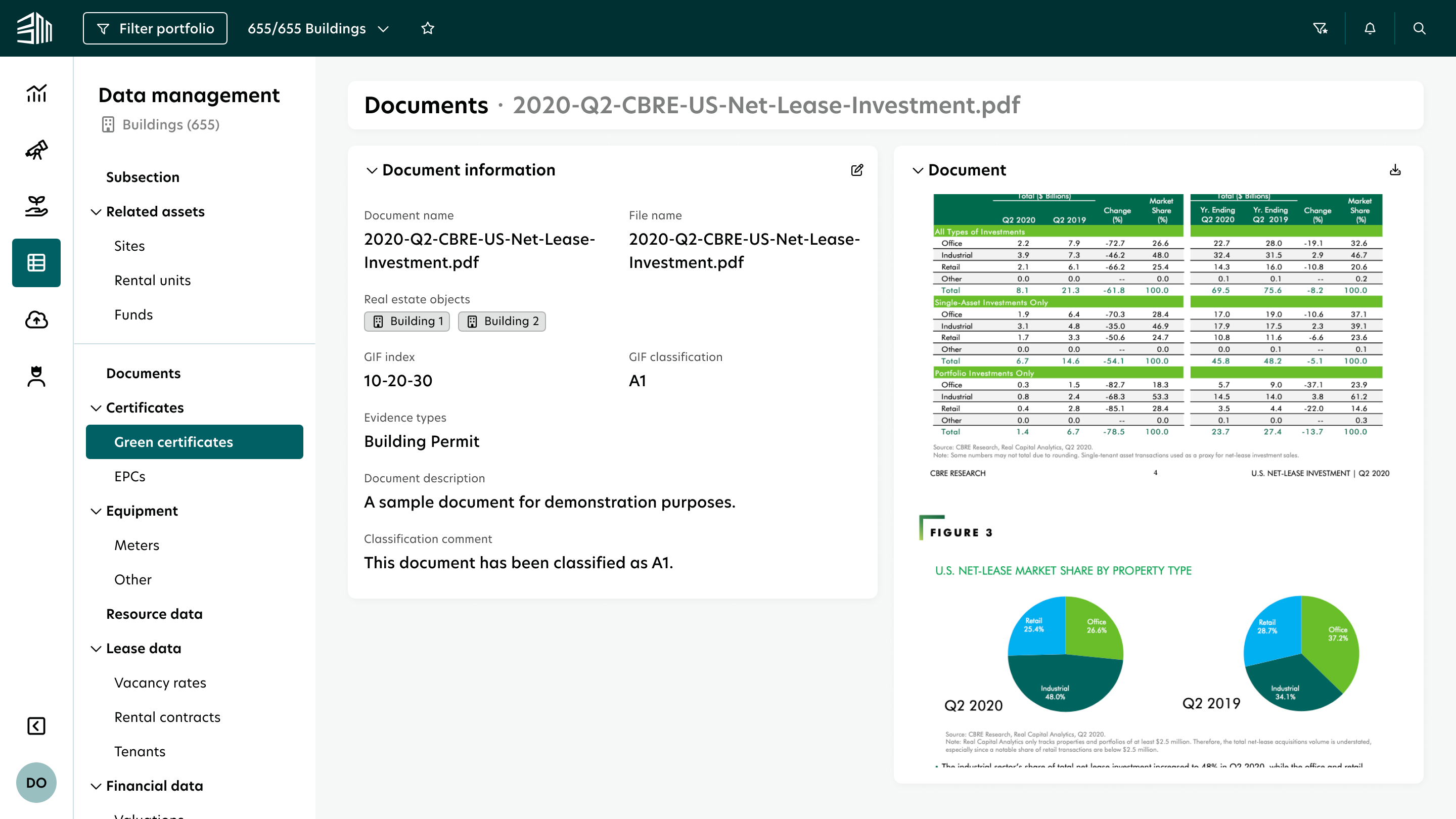
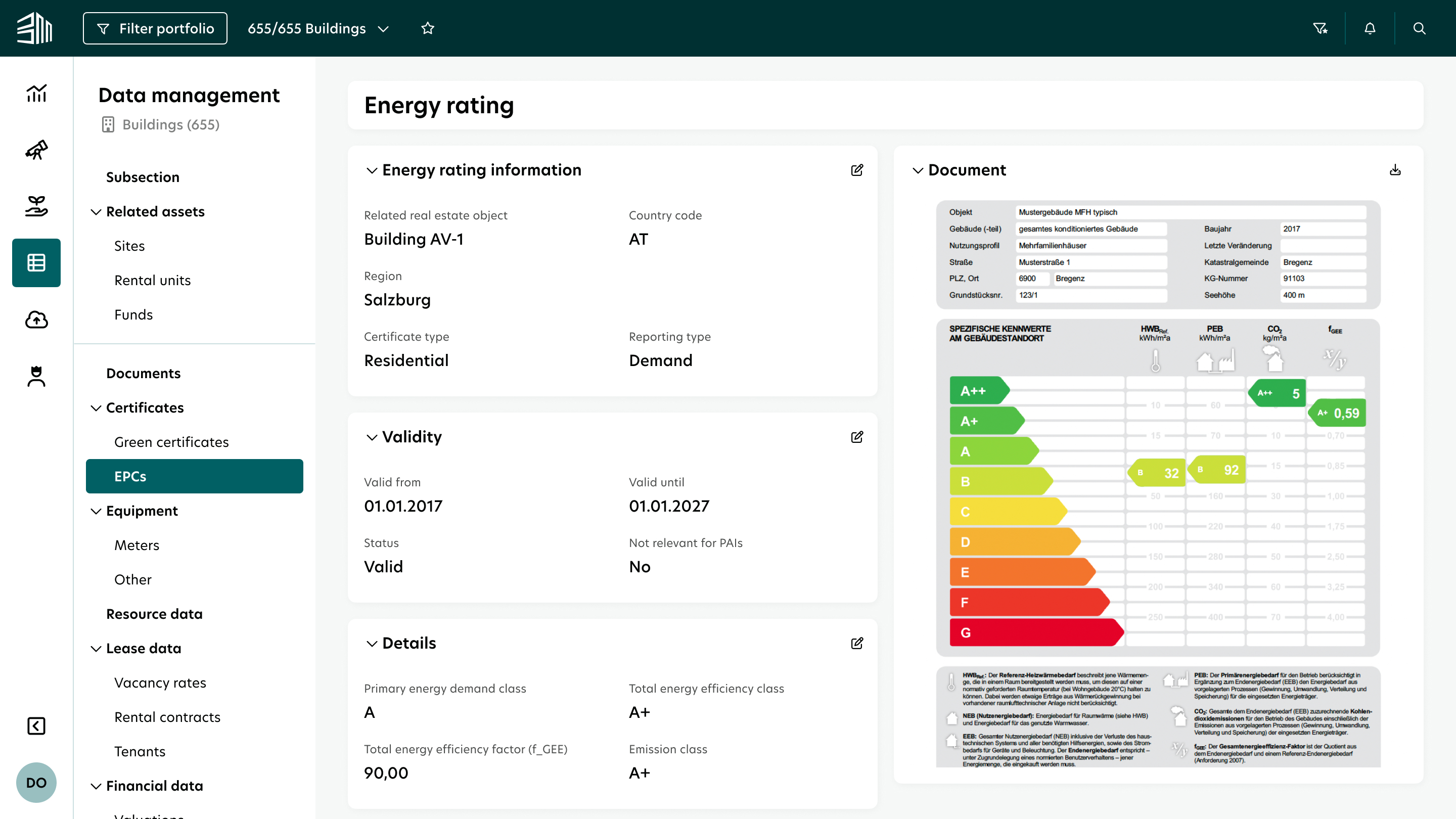
The original interface was limited by standard Power BI templates, resulting in a cluttered and unpolished UI that suffered from poor screen utilisation. Because the technology was rigid, visualisations remained static and monochromatic, forcing users to scan through repetitive charts that lacked clear hierarchy and visual appeal.
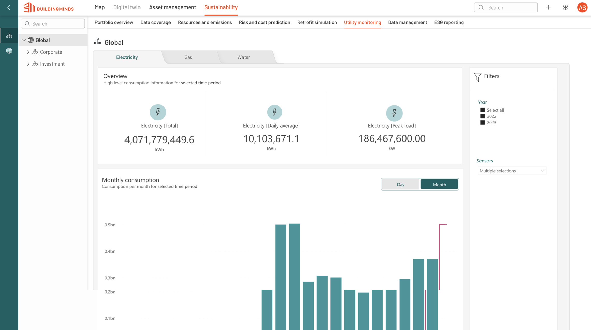
Migrating to a custom E-charts library transformed the reporting experience into a high-density widgeting system that maximises screen real estate. This technical shift allows for a sophisticated, modern UI featuring advanced visualisations like progress rings and heatmaps, enabling users to interpret complex datasets and take immediate action through a fully customisable interface.
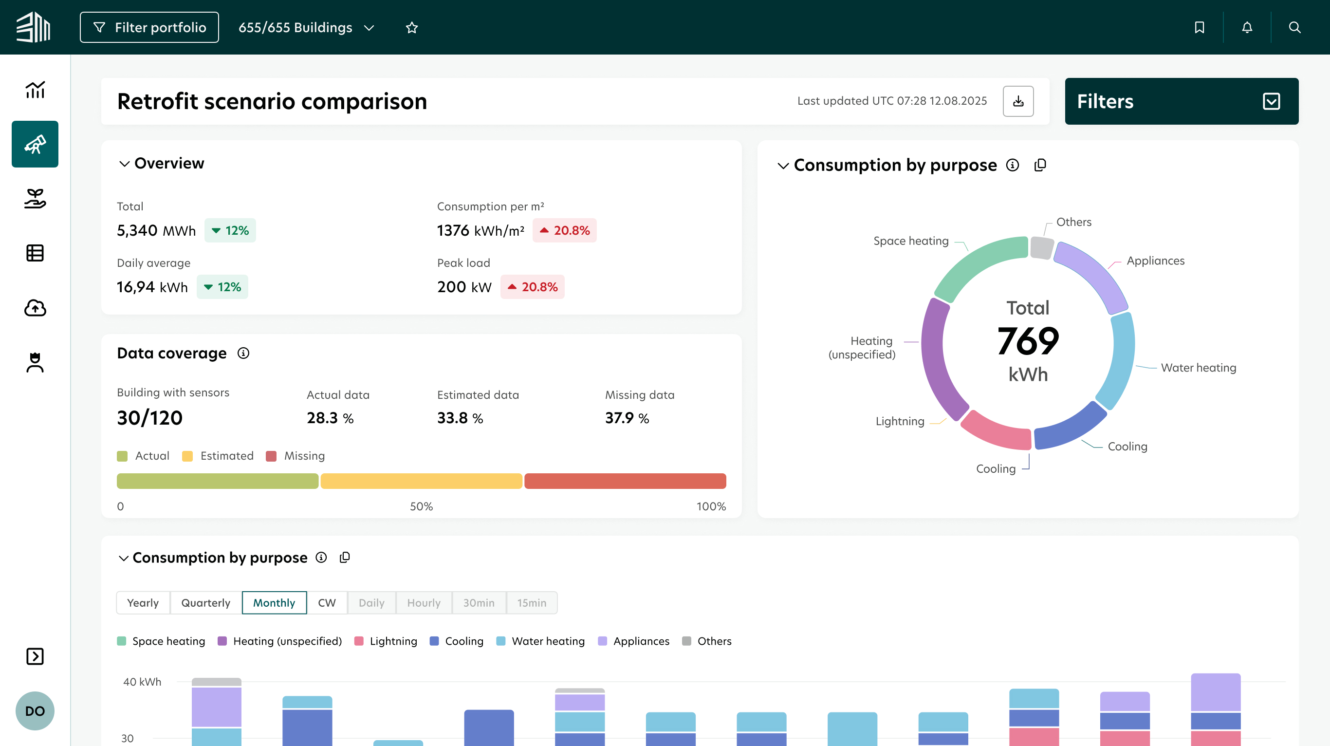
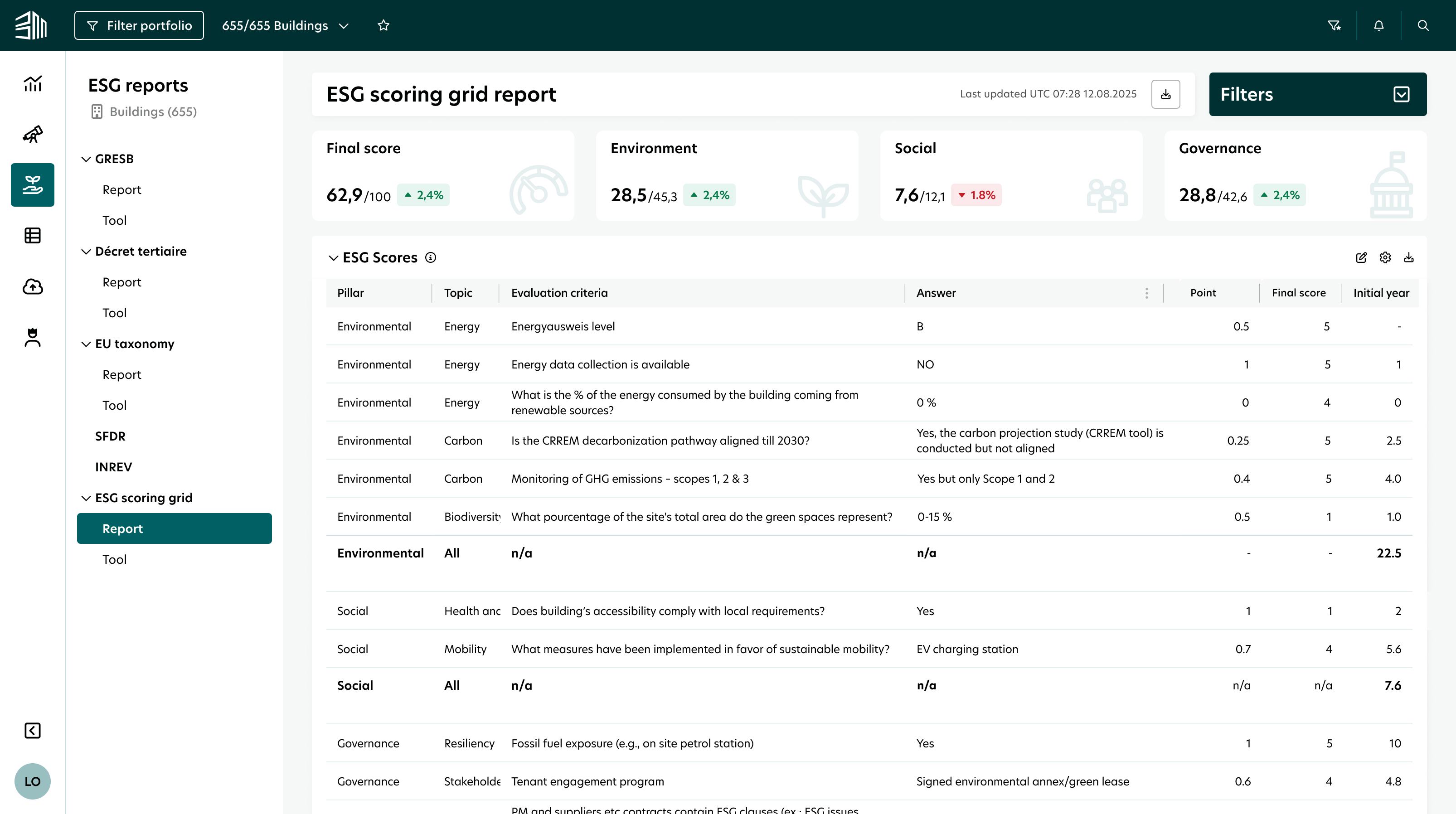
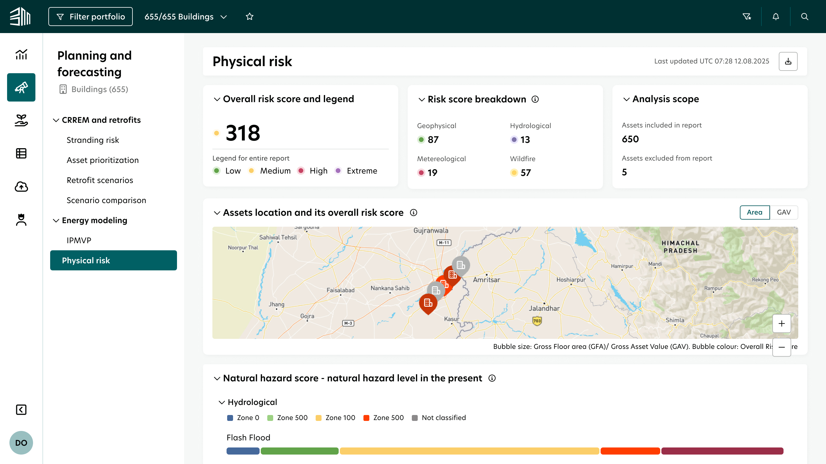
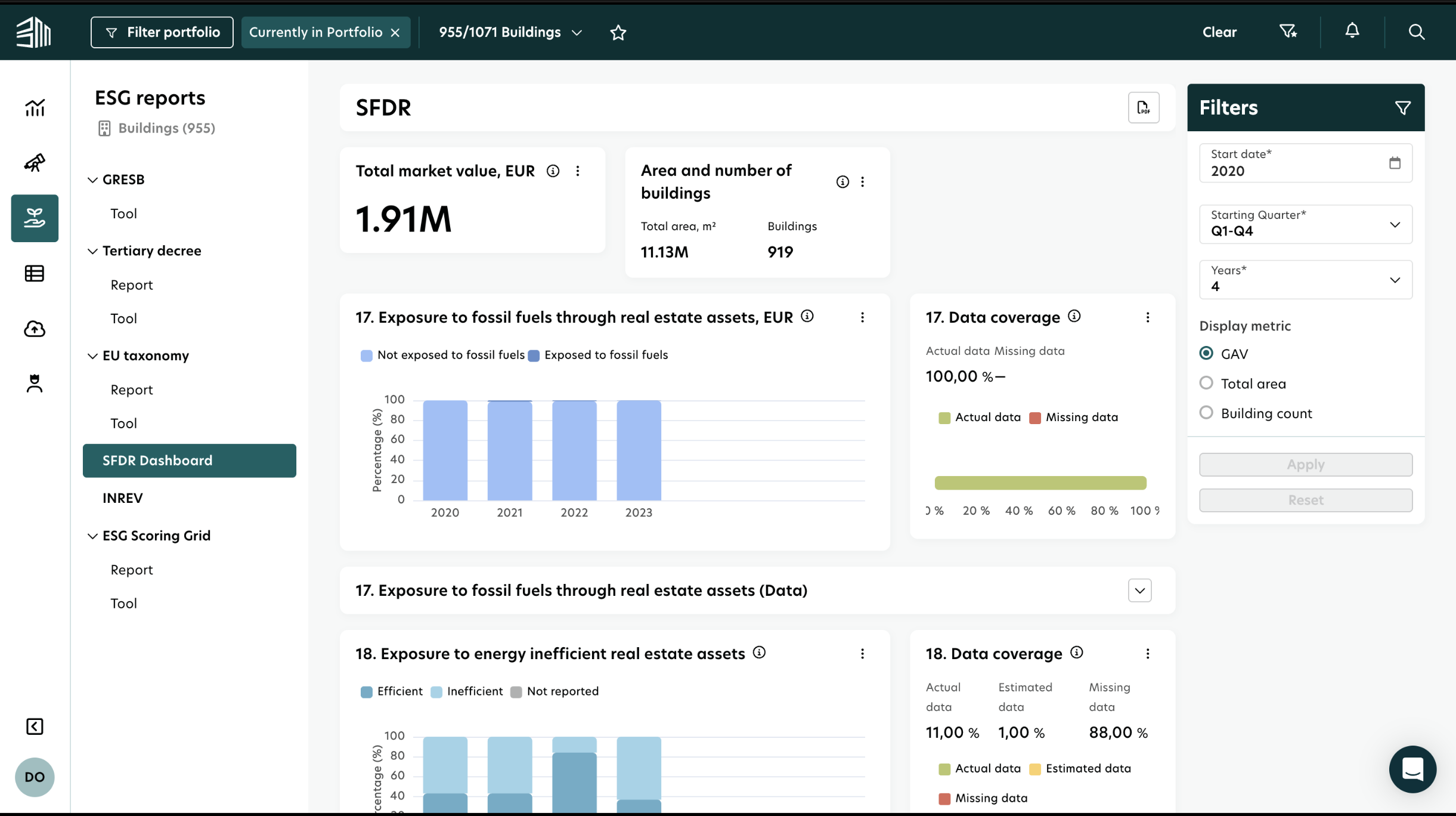
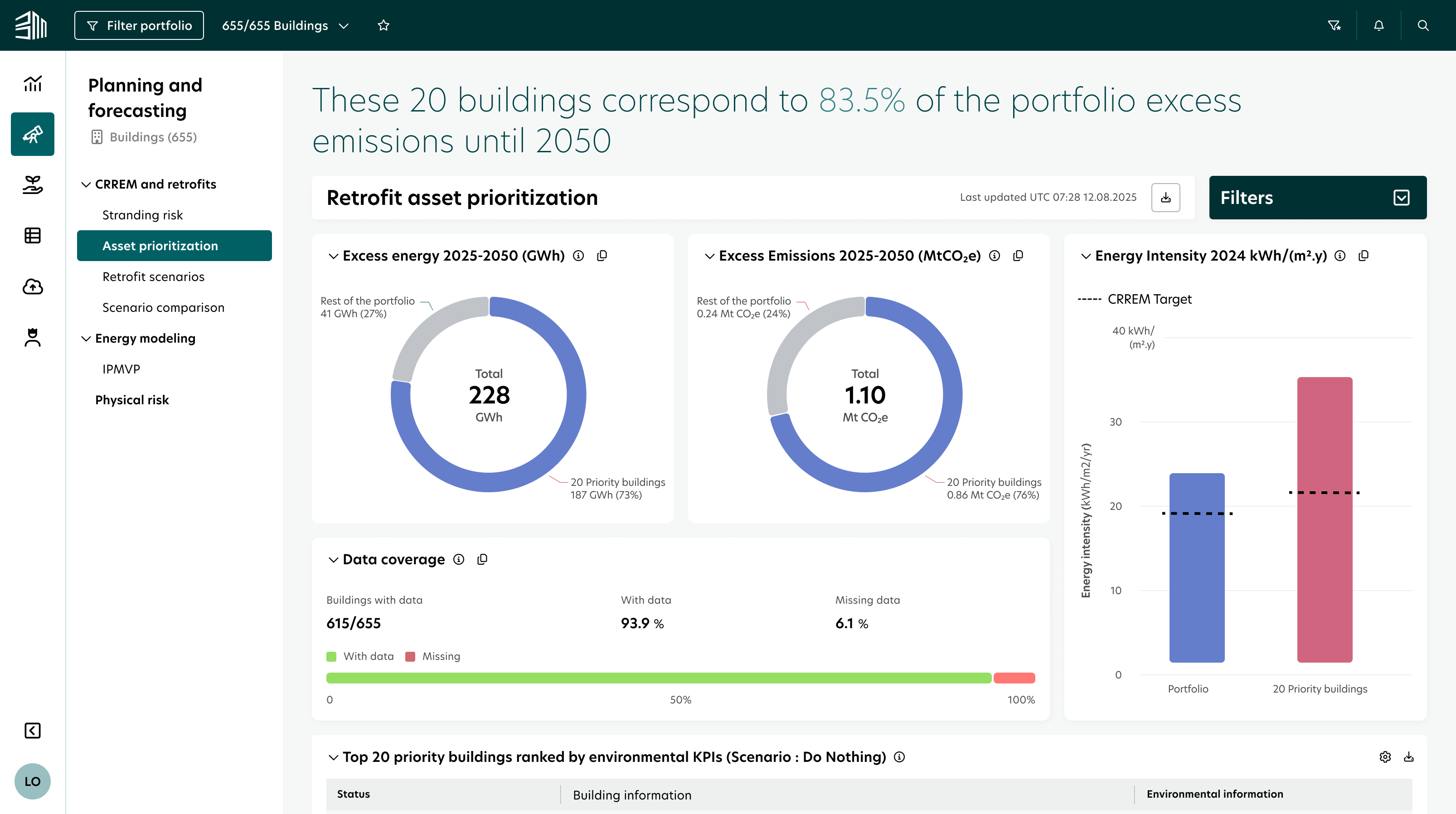
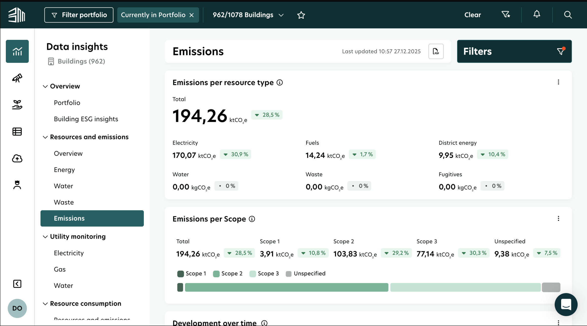
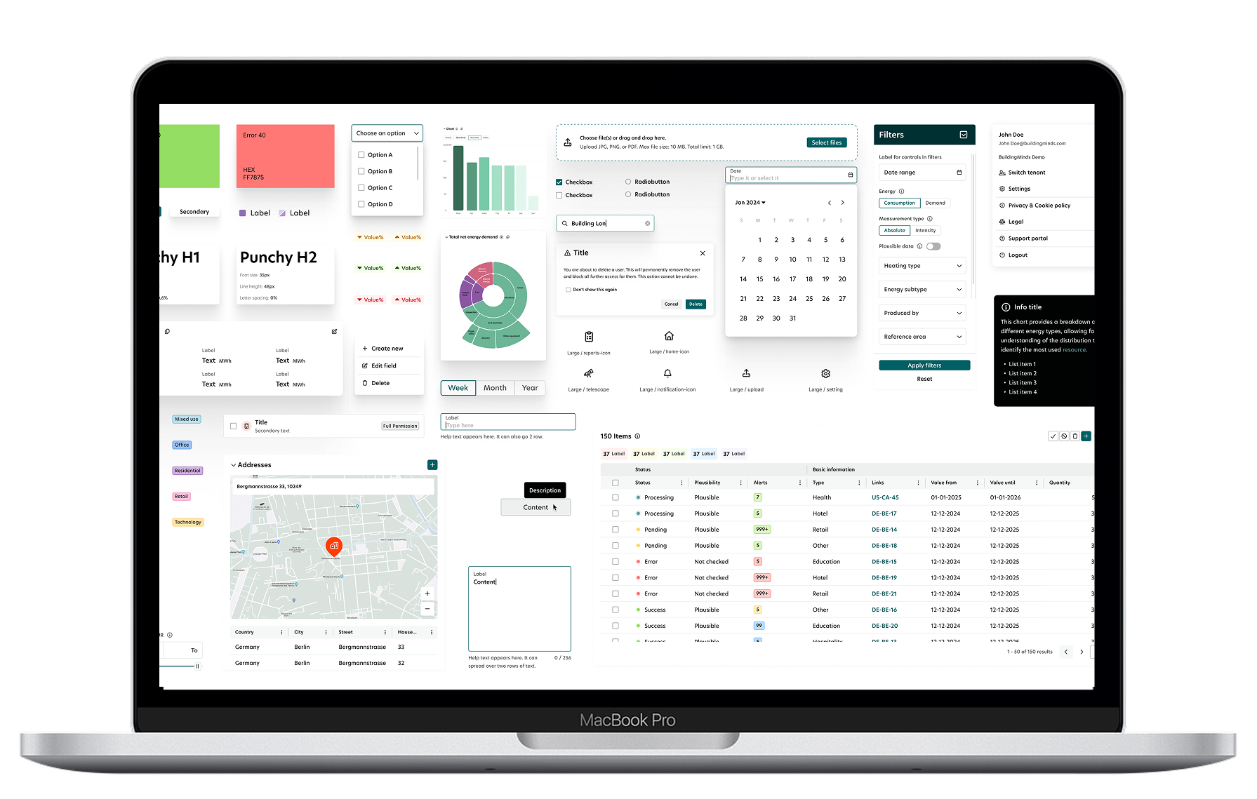
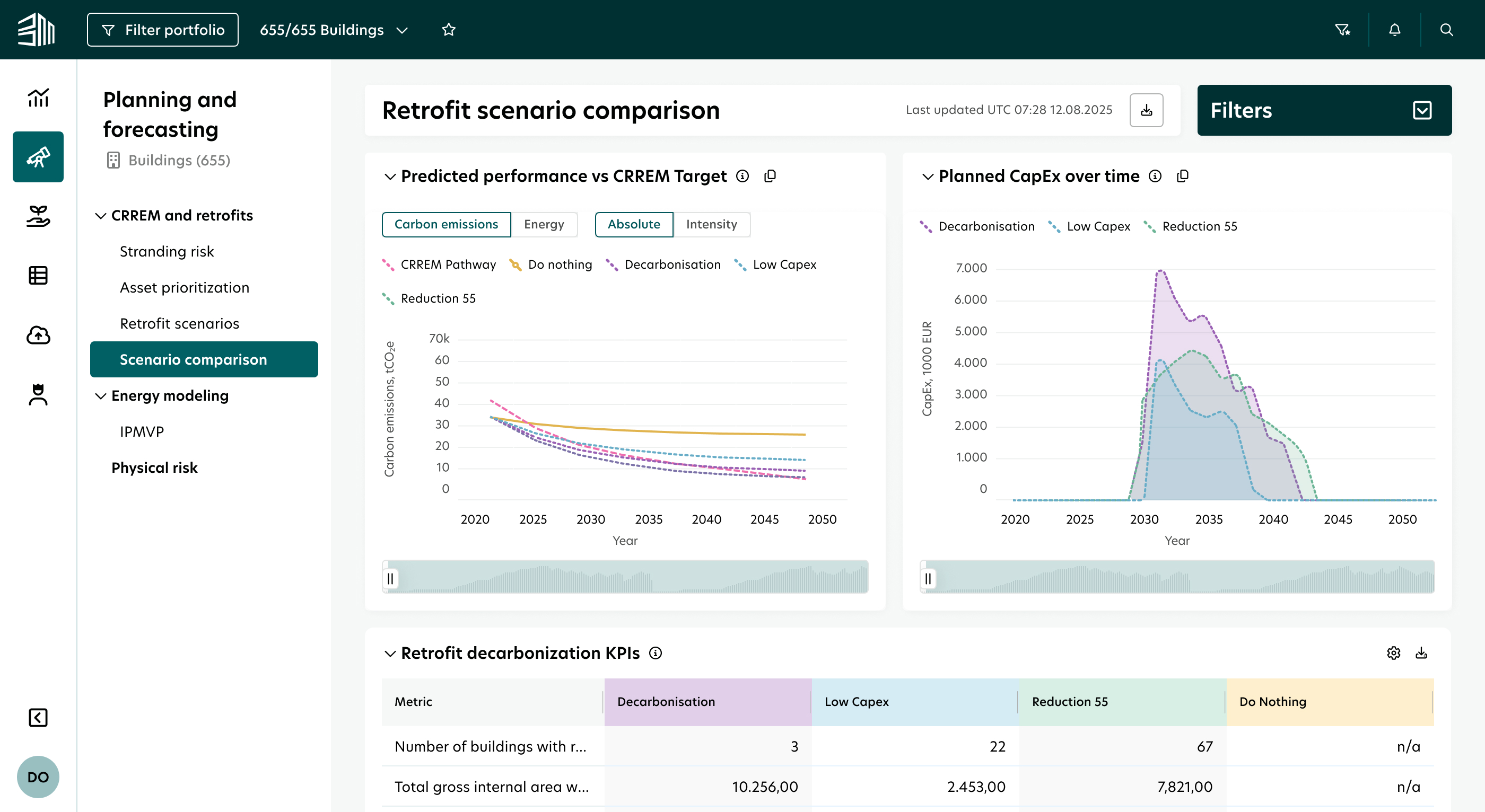
The interface was limited by standard Power BI templates, which prevented the use of custom components and resulted in an unpolished UI. Because the technology was rigid, filtering options were restricted to basic out-of-the-box tools, making it difficult for users to isolate specific data points or achieve a refined view of their portfolio.
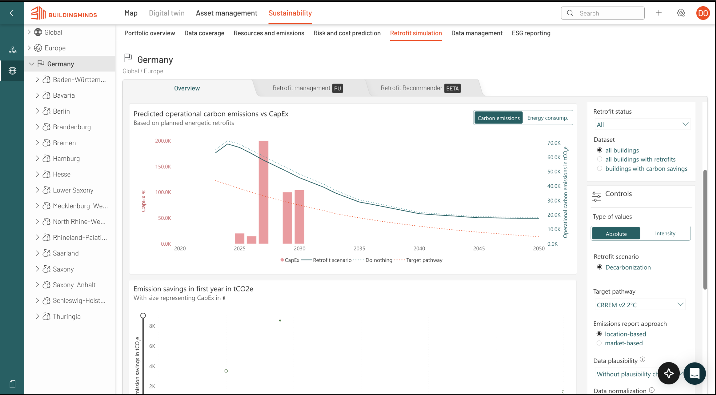
By migrating to a custom-engineered solution, we implemented a proprietary filtering system that provides total control over data segmentation. This shift allows for a much cleaner, more intuitive UI where users can apply complex, multi-layered filters through our own bespoke components, drastically improving the speed and precision of data analysis.
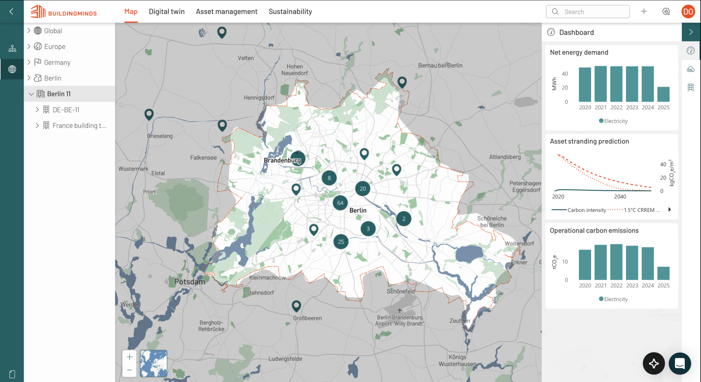
The legacy interface relied on a cumbersome left-hand sidebar that required users to click up to seven times to drill down to the building level. Without robust filtering options, finding specific information was a manual and repetitive process, while the navigation panel itself occupied significant screen real estate, crowding the primary workspace.
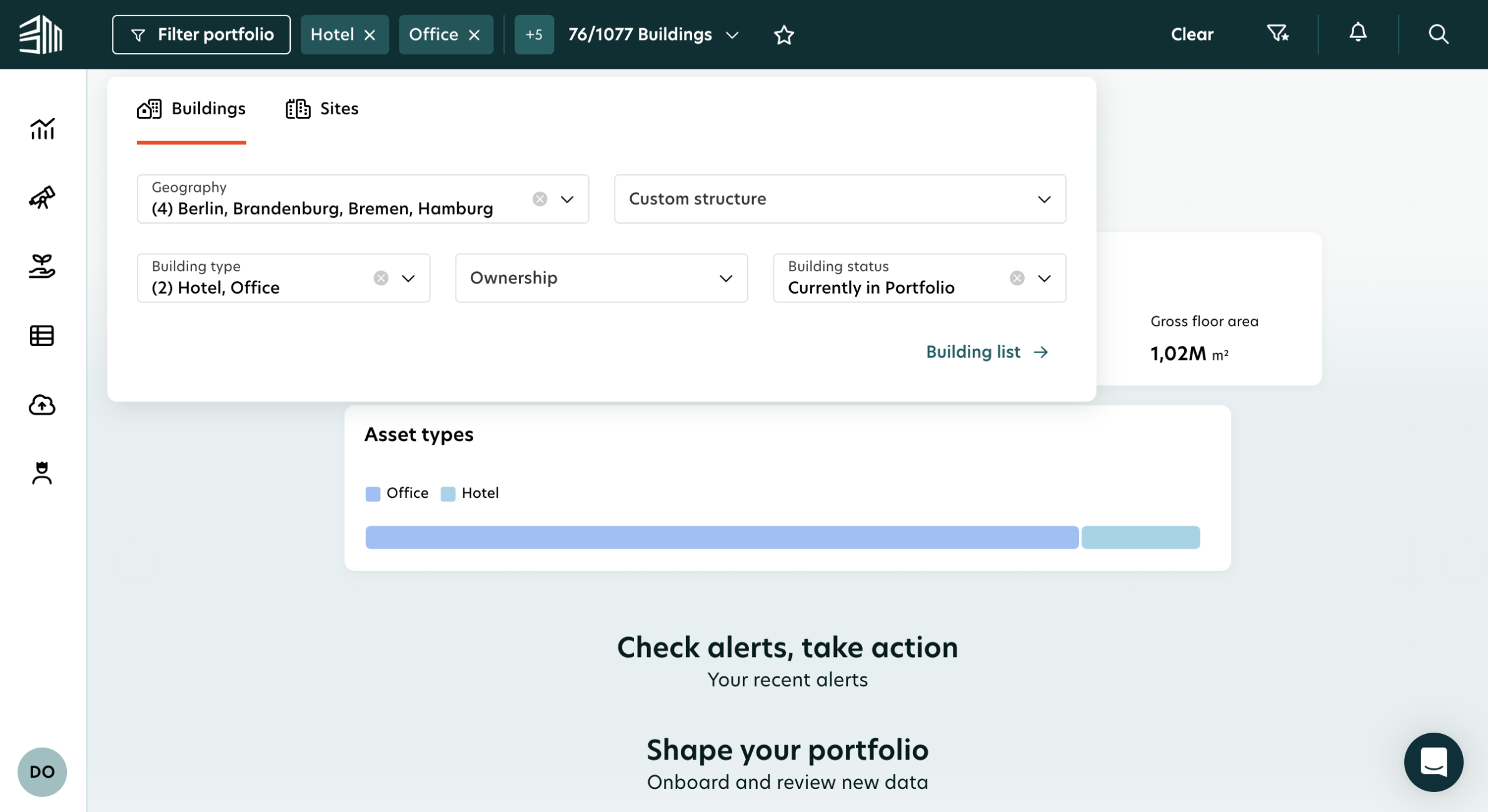
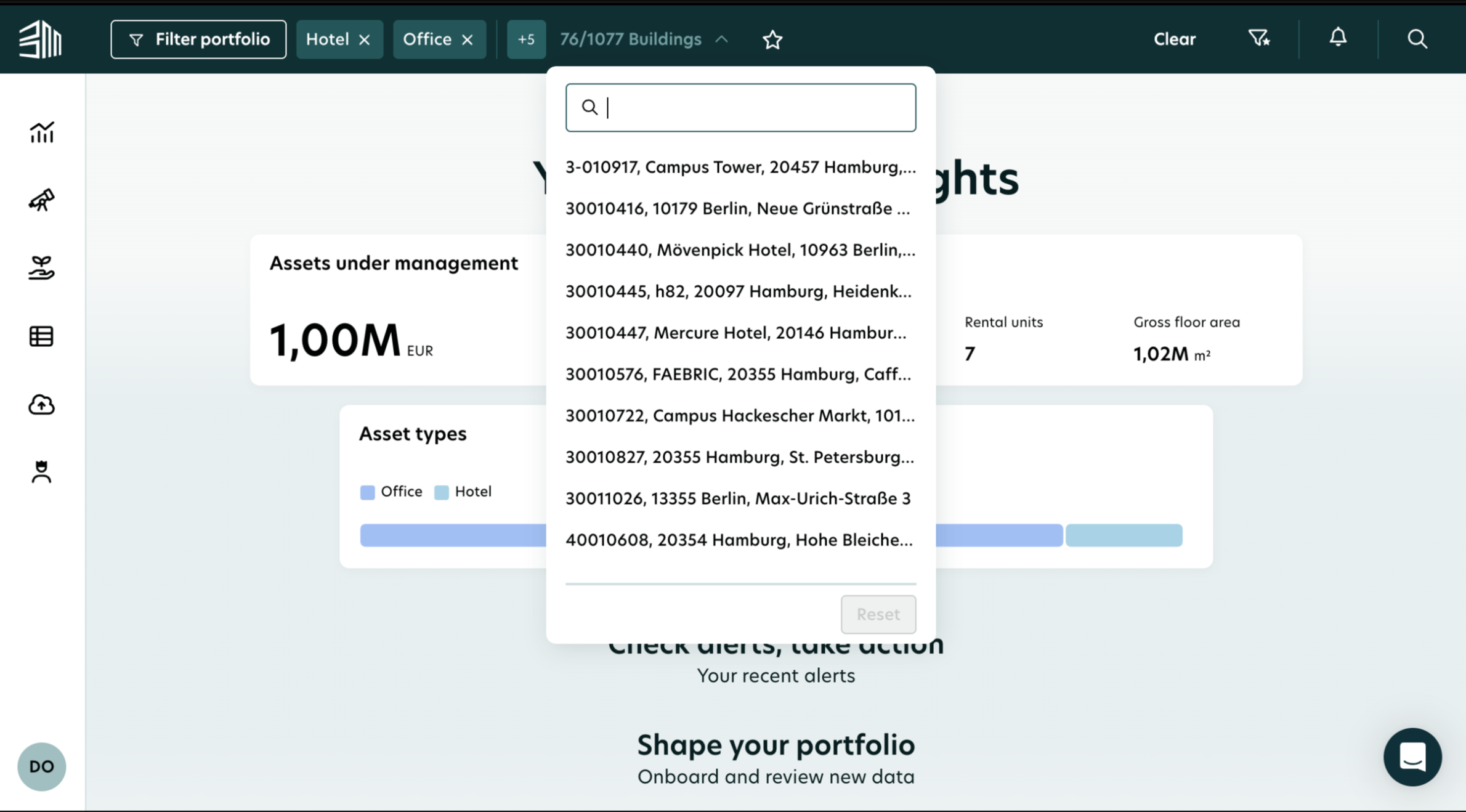
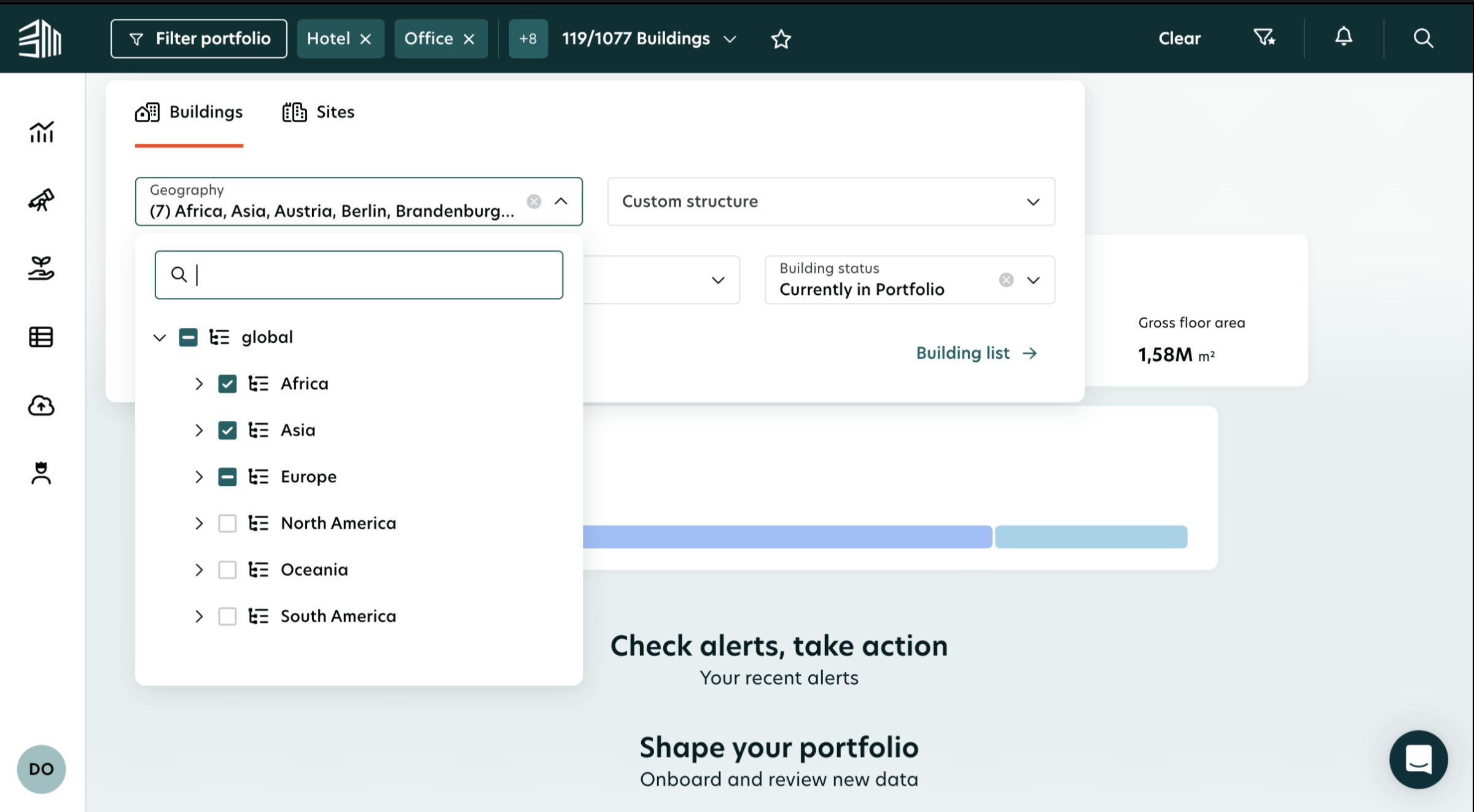
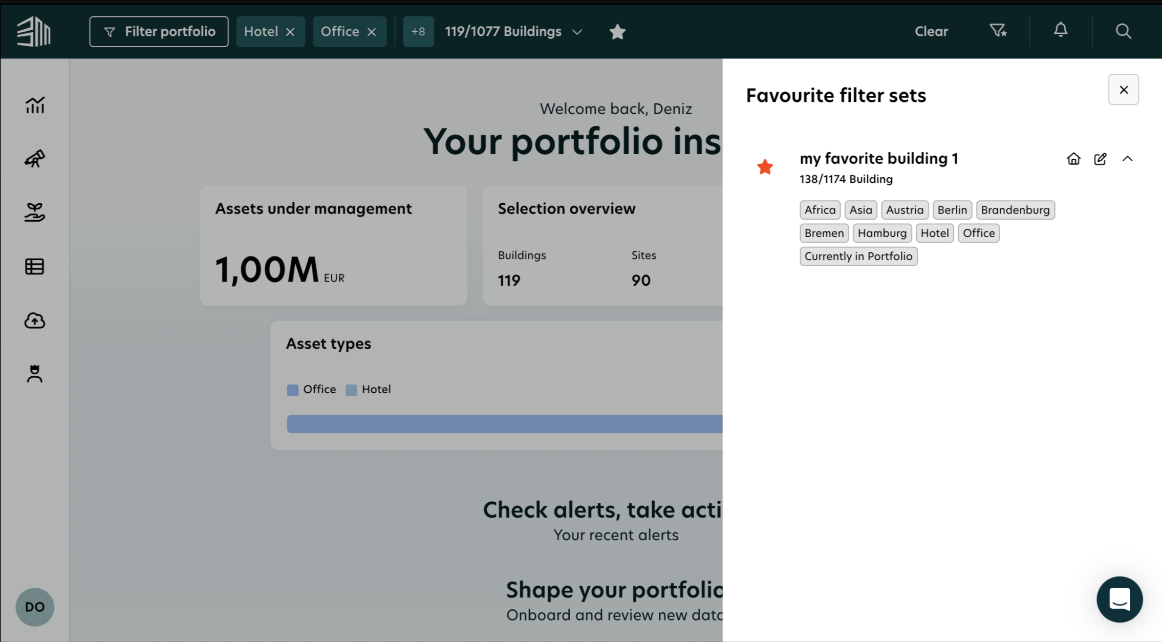
The redesign moves core controls to a streamlined top navigation bar, freeing up the workspace and reducing the path to building information to just two clicks. Integrated high-level filters allow for instant data segmentation, while the new favourites feature empowers users to jump directly to their most important assets in a single click.
The redesigned Proxima platform was recognised at two of the world's leading design awards — the iF Design Award 2026 and the UX Design Awards — validating both the craft of the work and its real-world impact for enterprise users.